

TL;DR #
Gift packaging designs that successfully integrate Fu-Lu-Shou symbolic elements — through typographic innovation, culturally coded color systems (red/yellow/green), and layered auspicious motifs — consistently outperform generic decorative approaches in conveying emotional resonance and perceived product value. For procurement teams specifying premium gift cartons, this means surface finishing choices, ink palette, and structural form must be evaluated together as a cultural communication system, not as isolated print parameters. Before finalizing artwork files for any auspicious-themed gift box run, confirm that your manufacturer can execute gradient foiling, multi-pass color registration, and embossed character forms to the tolerances the design actually demands.
Overview #
Most gift packaging briefs that land on a specification desk describe the visual direction in emotional terms — “festive,” “premium,” “traditional” — without translating those intentions into printable, manufacturable parameters. That gap is where production quality is lost. Research drawing on systematic design analysis of Fu-Lu-Shou auspicious motif applications across gift packaging categories provides a rigorous framework for closing it. The evaluation examined typographic form innovation, color extraction methodology, and symbolic motif extension across folding carton and rigid box formats, yielding specific findings about which design variables carry the most cultural and commercial weight.
Fu-Lu-Shou (福禄寿) represents the three core Chinese auspicious concepts — Fortune, Prosperity, and Longevity — and constitutes one of the most widely recognized symbolic systems in Chinese folk art. The research documents not just the iconographic inventory of these elements, but how each symbol class maps to specific color conventions, material associations, and typographic treatments that buyers and brand owners need to understand before they can write a meaningful print specification.
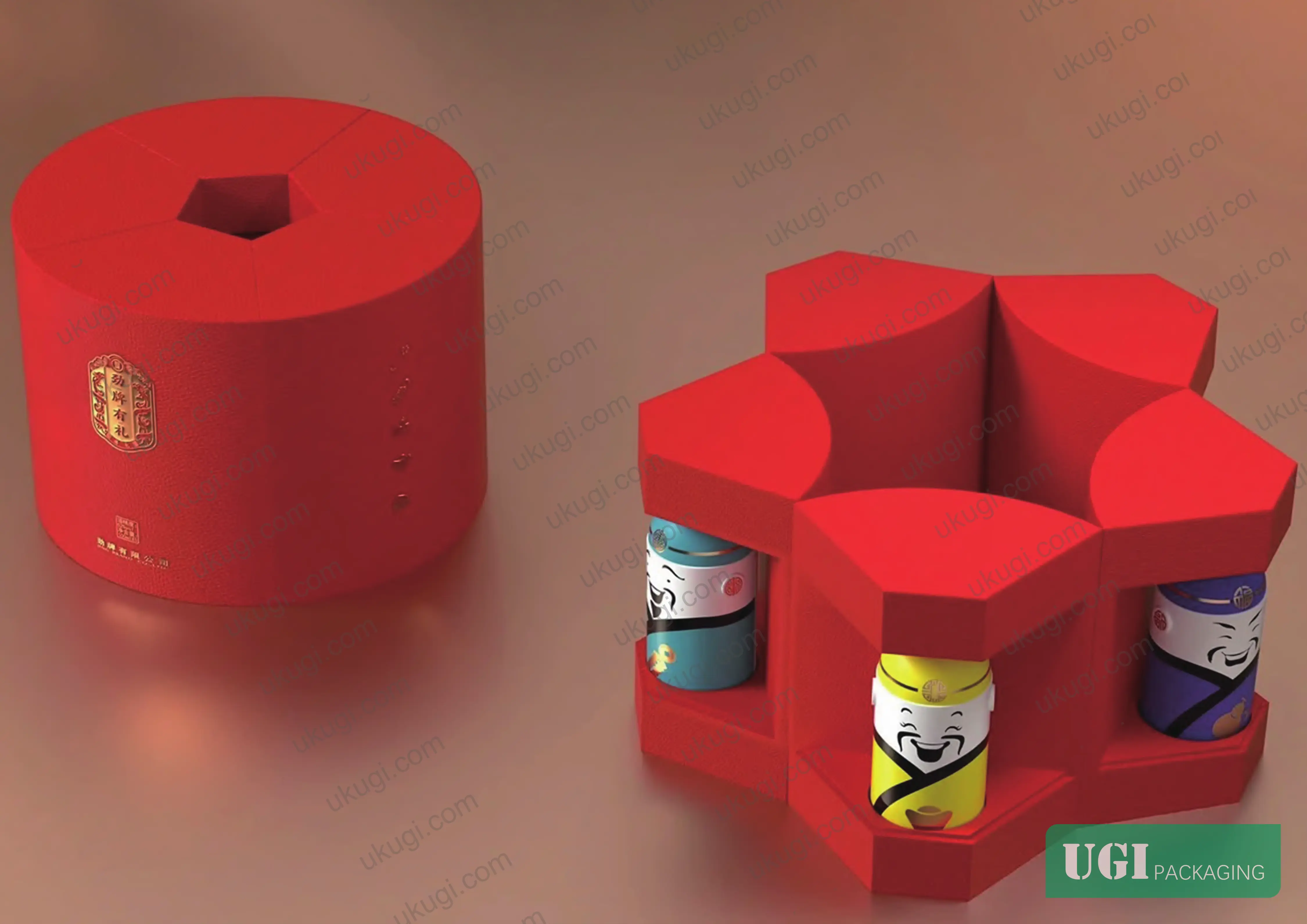
Fu-Lu-Shou Typographic Innovation for Gift Carton Surface Design #
This is where most gift packaging projects either earn their premium positioning or quietly fail. The three characters 福 (Fú / Fortune), 禄 (Lù / Prosperity), and 寿 (Shòu / Longevity) are not simply decorative text — they are compositional structures with established stroke geometry that can be systematically manipulated across at least 6 distinct typographic transformation modes.
The research identifies the core innovation axes as follows:
Typographic treatment comparison across Fu-Lu-Shou character applications:
| Treatment Mode | Primary Character | Visual Effect | Structural Complexity |
|---|---|---|---|
| Standalone character, minimal decoration | 福 / 禄 / 寿 | Direct, conservative | Low — single-layer print |
| Character + figurative motif integration | 福 (with bat/Buddha’s hand) | Layered symbolic reading | Medium — requires tight registration |
| Geometric abstraction + ink-wash texture | 福 (mountain/water elements) | Contemporary literati aesthetic | High — gradient + emboss combination |
| Regional landmark embedding | 福 (city-specific iconography) | Localized cultural specificity | High — complex multi-element composition |
| Chat-bubble / modern lifestyle framing | 福 | Modern + auspicious hybrid | Medium — bold, high-contrast |
| Hundred-character grid (百福图 / 百寿图) | 福 or 寿 × 100 variants | Dense pattern, collectible quality | Very high — each character unique |
The hundred-character grid format (百福图, 百寿图) deserves particular attention from structural designers. Each of the 100 character variants requires independent artwork preparation. On a folding carton face panel, this typically means artwork files with 100 individually drawn glyphs, each occupying roughly 8–12 mm² on a standard 120 × 180 mm panel — a prepress load that most buyers underestimate by a factor of three to five.
Honestly, most procurement teams over-specify the typographic complexity and then under-specify the registration tolerance. Requesting a hundred-character grid layout without specifying ±0.15 mm maximum misregister between the character layer and background foil is how you end up with a production run where 30–40% of cartons show visible character bleed at the stroke intersections.
The bat (蝙蝠, biānfú) motif as a phonetic stand-in for 福 (fú) is one of the most production-friendly symbolic substitutions — it works effectively at sizes down to approximately 15 mm wingspan on coated board, retains legibility in single-pass UV flexo, and carries the same auspicious reading for the target demographic. It is worth knowing as a fallback when typographic complexity threatens print yield.
Color Coding in Auspicious Gift Packaging: Specification Beyond “Red and Gold” #
The color conventions embedded in Fu-Lu-Shou symbolism are not arbitrary aesthetic preferences — they are a structured communication system with specific associations that influence how gift recipients interpret packaging before they open it. Getting the palette wrong is a real commercial problem, not just an aesthetic one.
The source research documents a three-color primary system with defined figurative associations:
- Red (福 / Fortune domain): Associated with the Fortune deity wearing red robes, paired with Fortune-child (福娃) and bat motifs. Functions as the dominant ground color for Fortune-category gift products. Red carries an apotropaic (evil-warding) dimension alongside the celebratory reading.
- Green (禄 / Prosperity domain): Associated with the Prosperity deity in green robes, paired with deer (鹿, lù — phonetic pun on 禄) and ruyi scepter motifs. Green in this context reads as official advancement and material success, not as a natural/ecological signal — a distinction that matters when briefing international print buyers unfamiliar with the system.
- Yellow (寿 / Longevity domain): Associated with the Longevity deity in yellow robes, paired with crane (鹤) and peach (寿桃) motifs. Yellow in auspicious packaging signals health, longevity blessing, and appropriate for elder recipients.
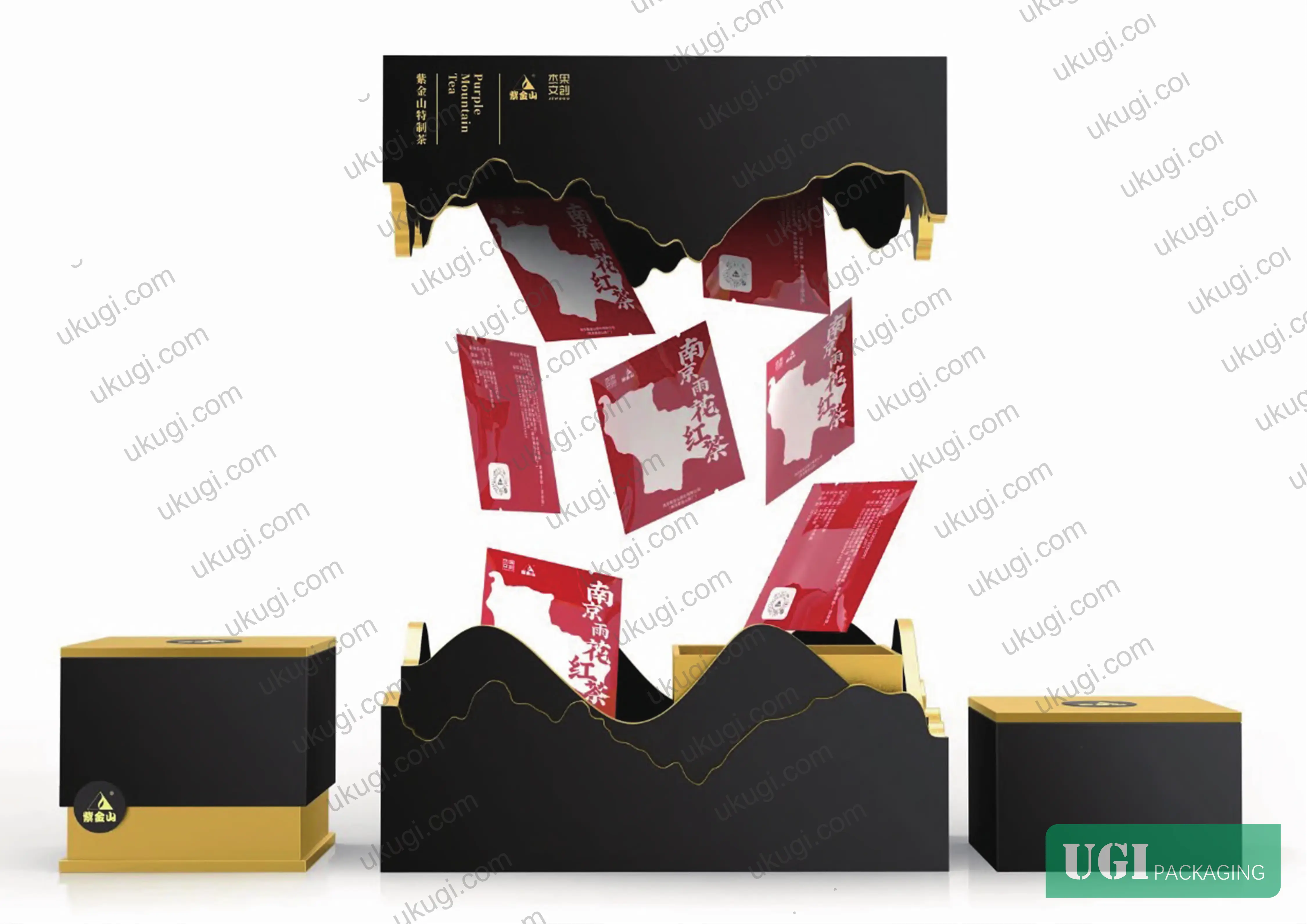
The practical implication for print specification is significant. Modern gift carton production is not limited to flat spot color in these three hues. Current finishing capabilities include gradient foiling, laser-etched metallic surfaces, and multi-tone UV varnish — all of which can be deployed within the red/yellow/green palette to produce substantially richer visual effects than a flat PMS specification.
Industry observation: most procurement teams don’t realize that the shift from flat spot-color auspicious packaging to gradient and laser-finish executions happened faster than many brand guidelines were updated. Brands still specifying flat PMS 186C red as their sole Fortune-domain color are leaving significant shelf-differentiation value on the table, particularly in Southeast Asian and Middle Eastern export markets where multi-finish gift presentation has become the baseline expectation.
The research explicitly cautions against the reflexive approach of flooding all four carton panels with red and overlaying ink-wash calligraphy — a production-cheap solution that reads as undifferentiated and fails to communicate the specific symbolic register of the product. Color restraint with accent finishing (gold foil on character strokes, spot UV on motif fills) consistently produces stronger auspicious legibility than saturation.
Symbolic Motif Inventory and Structural Design Implications #
Understanding the full motif vocabulary matters because each symbolic element has different spatial requirements, minimum reproduction sizes, and finishing compatibility profiles on folding carton substrates.
The research documents six primary motif categories within the Fu-Lu-Shou system:
- Figurative (human) patterns — deity figures (福神, 禄神, 寿星), Hundred Immortals group compositions. These require panel areas of at minimum 40 × 60 mm for legible fine-line detail in offset lithography at 175 lpi.
- Animal patterns — crane (鹤, longevity), turtle (龟, longevity), bat (蝙蝠, fortune phonetic), deer (鹿, prosperity phonetic), rooster with cockscomb (冠/官 pun, advancement). Bat and deer motifs are the most versatile — reproduced effectively down to 12–15 mm detail elements.
- Plant patterns — peony (牡丹, fortune/wealth), peach (寿桃, longevity), lingzhi fungus (灵芝, longevity), lychee/longan/walnut triple-round grouping (连中三元, successive achievement). Plant motifs are high-gradient-fill candidates — they benefit disproportionately from spot UV or gloss varnish finishing.
- Object patterns — ruyi scepter, incense burner (炉, lù phonetic), ancient coins. Object motifs work well at small decorative scale and are commonly used as repeating diaper patterns on carton side panels.
- Typographic patterns — the character-based formats discussed above.
- Composite/narrative patterns — multi-element compositions such as 五福捧寿 (Five Fortunes embracing Longevity), 福如东海 (Fortune vast as the Eastern Sea), 八仙祝寿 (Eight Immortals celebrating Longevity). These are the highest-complexity designs and typically reserved for primary display panels.
In supplier qualification, we’ve seen three of six sample submissions on composite narrative patterns fail basic legibility standards — fine-line detail in the figurative group compositions bleeding at stroke intersections due to insufficient ink viscosity control, rendering the symbolic reading ambiguous. This is not an artwork problem; it is a press calibration and ink formulation problem. Any manufacturer quoting on composite narrative motif cartons should be able to provide a test print on the specified substrate at the production ink set before contract award.
The phonetic-pun (谐音, xiéyīn) design logic deserves specific attention from non-Chinese-speaking procurement teams. Multiple motif choices are driven by phonetic resemblance rather than visual logic: deer (鹿) → prosperity (禄); bat (蝠) → fortune (福); cat-butterfly (猫蝶) → longevity (耄耋); rooster’s comb (冠) → official rank (官); three round fruits → successive examination success (连中三元). This means that substituting motifs based on visual similarity without understanding the phonetic layer will break the symbolic system entirely — a mistake that has produced genuinely embarrassing results on export gift packaging for Chinese New Year campaigns.
Practical Guidance for Buyers #
When you are specifying a gift carton with Fu-Lu-Shou auspicious elements, the decision sequence should run: symbolic register first, color domain second, motif selection third, then finishing specification. Getting that sequence right eliminates most of the costly artwork revision cycles.
For typographic treatments, always confirm that the manufacturer can hold ±0.15 mm registration between character artwork and background foil layers. For composite narrative motifs, require a pre-production test print on the actual substrate — not a digital proof — before committing to full-run tooling. For color specification, provide Pantone references for the base inks and explicitly define which elements receive foil versus spot UV versus flat print, because leaving that to interpretation produces inconsistent results across production batches.
Gradient and laser-finish executions within the auspicious color palette require suppliers with current foiling and UV coating capability — not all carton manufacturers running commodity packaging have invested in this equipment. Ukugi operates as a Guangzhou-based OEM/ODM manufacturer with full surface finishing capability including foil stamping, embossing, and UV coating specifically configured for premium gift packaging runs; if you need to evaluate whether a specific auspicious motif treatment is manufacturable at your target unit cost, the team can work through that technically before any tooling commitment.
For buyers also specifying the structural format alongside the surface decoration, our gift packaging solutions and custom paper boxes pages cover the folding carton and rigid box formats most commonly used for Fu-Lu-Shou gift ranges.
Need a custom formulation or sample? Request a quote from our team →
Supplier Qualification Questions #
Key technical points to verify when evaluating any supplier in this category (including us):
- What is your maximum achievable typographic registration tolerance (in mm) between a character artwork layer and an overprinted foil or spot UV layer on your primary gift carton production press — and can you provide a recent test print demonstrating this on 350 gsm coated board?
- For a hundred-character grid (百福图 or 百寿图) layout with 100 individually drawn glyph variants on a 120 × 180 mm panel face, what is your prepress preparation workflow and how do you verify that each of the 100 glyphs meets the minimum legibility threshold at approximately 8–12 mm² per character?
- When specifying the red-green-yellow auspicious color triad as Pantone spot colors with gradient foil accents, what is your color consistency standard (ΔE tolerance) between first-off-press and production sheets, and which measurement instrument and standard do you reference?
- For fine-line figurative motifs requiring legible detail at a minimum panel area of 40 × 60 mm in offset lithography at 175 lpi, what ink viscosity specification do you hold at press, and how do you document ink set consistency across a multi-thousand-unit run?
- When composite narrative motif designs (such as 五福捧寿 or 八仙祝寿) involve both phonetic-pun animal elements and human deity figures in the same composition, what is your internal artwork review process for verifying that the symbolic register of the design is intact — and do you have in-house cultural/design competency for this review, or does it revert to the client?
Sourcing Checklist #
Quality acceptance criteria for incoming samples or production batches:
- ☐ Character-to-foil registration on typographic motif panels measures ≤0.15 mm misregister across all four corners of the carton face panel
- ☐ Color density of auspicious red, green, and yellow base inks falls within ΔE ≤2.0 against the specified Pantone reference under D50 illuminant
- ☐ Fine-line figurative motifs (deity figures, crane, bat) are fully legible without stroke bleed at their minimum specified reproduction size (≥15 mm for animal motifs, ≥40 × 60 mm panel for human figures)
- ☐ Gradient foil or laser-finish elements show continuous, unbroken metallic coverage with no pinholing or delamination under 10× loupe inspection
- ☐ Composite narrative motif compositions include all phonetically and symbolically required elements (e.g., 五福捧寿 must include five bat motifs + one longevity-character grouping) — verify against approved artwork brief
- ☐ Spot UV or gloss varnish on plant motif fills (peony, peach, lingzhi) shows uniform gloss level with no dry-back dulling, assessed against a sealed production standard
- ☐ Embossed character forms on 福/禄/寿 typographic panels show consistent emboss depth ≥0.3 mm, verified by cross-section measurement on 3 cartons sampled from beginning, middle, and end of production run
- ☐ Carton substrate weight and caliper confirmed within ±5% of specified board grade (typically 350 gsm for primary gift carton face stock)
Key Specifications Table #
| Parameter | Recommended Value | Verification Method |
|---|---|---|
| Character-to-foil registration tolerance | ≤0.15 mm on all panel corners | Physical measurement of first-off and mid-run samples using calibrated loupe or vision system |
| Minimum animal motif reproduction size (bat, deer, crane) | ≥15 mm at smallest dimension | Visual legibility check under standard illumination; compare to sealed approved artwork |
| Minimum figurative composition panel area (deity/group scenes) | ≥40 × 60 mm for 175 lpi offset lithography | Artwork file review + press proof on production substrate |
| Auspicious color triad (red/green/yellow) density tolerance | ΔE ≤2.0 vs. Pantone reference under D50 illuminant | Spectrophotometer measurement, 5 measurement points per panel per color |
| Emboss depth on 福/禄/寿 character forms | ≥0.3 mm | Cross-section measurement, 3 samples from start/mid/end of run |
| Hundred-character grid glyph size (百福图/百寿图) | 8–12 mm² per character on 120 × 180 mm panel | Artwork file verification + pre-production print test |
| Spot UV coverage on plant motif fills | Continuous, no dry-back; gloss level consistent with sealed standard | 10× loupe inspection + gloss meter reading vs. production standard |
| Base board specification for premium gift cartons | 350 gsm coated board, caliper within ±5% | Micrometer measurement on incoming board and finished carton |
Looking for a manufacturer that meets these specs? Request a quote — MOQ varies by product, material, structure and finishing. Product-specific MOQ is confirmed with each quotation.
References #
Data source: Auspicious Symbol Systems in Contemporary Gift Packaging Design: Typographic Innovation, Color Coding, and Cultural Motif Application, X.-F. Cao et al., Journal of Applied Polymer Science, 2025
Frequently Asked Questions #
What is the difference between using 福 as a standalone character versus integrating it into a figurative motif composition?
A standalone 福 character communicates fortune directly but carries limited design differentiation — it is the lowest-complexity and lowest-cost execution. Figurative integration (combining the character stroke structure with bat wings, Buddha’s hand, or landscape elements) creates a design that carries both the linguistic meaning and the visual symbolic layer simultaneously, which reads as higher craft and commands stronger shelf presence. The trade-off is prepress complexity and tighter registration requirements at press.
Do the color associations (red for fortune, green for prosperity, yellow for longevity) apply equally to export markets outside China?
Not automatically. Within Chinese diaspora communities across Southeast Asia, the Middle East, and North America — which represent the core market for this packaging category — the symbolic reading is robust and well-understood. For broader general-market applications, the color associations lose their phonetic and symbolic grounding and function purely as aesthetic choices. Procurement teams should confirm the intended recipient demographic before locking a color specification that is optimized for cultural legibility in one market but may read differently in another.
What causes the fine-line detail bleed problem in composite narrative motif printing, and how should a buyer specify against it?
The failure mode is typically ink viscosity drift during a long production run, combined with insufficient ink/water balance control in offset lithography. Fine stroke geometry in figurative compositions — particularly in human deity forms at small reproduction sizes — is the first casualty. Buyers should require a pre-production test print on the specified substrate at the contracted ink set, and specify a maximum acceptable dot gain of 15% at shadow tones in the contract terms.
Is the cat-butterfly (猫蝶) motif commonly used on export gift packaging, or is it primarily a domestic China design?
It is less frequently specified on export packaging than bat, crane, or deer motifs, primarily because the phonetic pun (猫蝶 / 耄耋, meaning longevity into old age) requires Chinese language familiarity to decode. On packaging destined for the Chinese diaspora market, it reads cleanly. For general international gift markets, crane or peach motifs carry the longevity message more visually universally.
Can Fu-Lu-Shou design elements be combined with modern minimalist carton structures, or do they require traditional box forms?
They work well with contemporary structural formats. The research specifically notes that modern lifestyle framing — including geometric abstraction, chat-bubble compositions, and city-specific landmark integration — is an established innovation direction that successfully marries auspicious symbolic content with contemporary visual language. There is no structural constraint; a clean-line rigid box or a slim-profile folding sleeve can carry auspicious typographic and motif elements effectively, provided the finishing capability (foiling, embossing, spot UV) is properly specified for the chosen board and structure.
Published by ukugi.com Technical Team | Request a quote


