

TL;DR #
In a structured consumer study with 194 valid responses across 6 benchmark packaging samples, aesthetic attributes (B3) ranked first with a weight of 0.460 — more than double the second-ranked factor — making visual design the single highest-leverage investment in specialty food packaging. For buyers commissioning regional food packaging, this means over-indexing on structural function at the expense of visual differentiation is a measurable strategic error that directly suppresses purchase intent. Before briefing any supplier, run an IPA quadrant analysis against your current packaging to identify which attributes need urgent improvement versus which ones are already over-resourced.
Overview #
Most packaging briefs for regional specialty food products open with functional requirements — seal integrity, drop resistance, moisture barrier — and treat visual design as a finishing step. That instinct is backwards, and quantitative consumer data confirms it. A study conducted at a Chinese university design school used a dual-method evaluation framework (AHP + IPA) combining pairwise importance weighting with satisfaction mapping across 160 valid consumer responses and 6 internationally benchmarked packaging samples. The methodology applied SPSSAU for weight calculation and SPSS 27.0 for reliability and validity verification — producing a Cronbach’s Alpha of 0.975 across 84 items, indicating exceptional internal consistency.
The 6 benchmark samples were selected through a three-tier expert panel (academic, design industry, and packaging trade) covering award-winning designs (including an iF Design Gold Award winner), top-selling commercial products, and high-recognition regional specialty items. This wasn’t a theoretical exercise — it was a structured comparison of real products competing in real markets.
The findings are directly actionable for any brand owner, packaging buyer, or OEM client evaluating design briefs for regional food products. Understanding how consumers weight aesthetic, regional, brand, functional, ecological, and uniqueness attributes — with specific numeric weights — allows procurement teams to allocate design investment where it actually moves the needle.

Aesthetic and Regional Attributes Drive Purchase Decisions in Specialty Food Packaging #
This is the core finding, and it should reshape how you write a packaging brief.
The AHP weight calculation — validated with a consistency ratio (CR) of 0.054, well below the 0.1 threshold — produced the following priority ranking across six criteria dimensions:
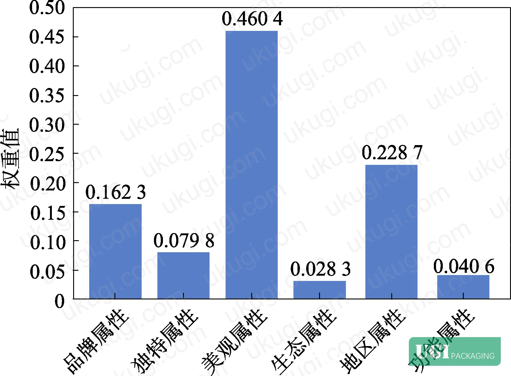
Criteria Layer Weight Rankings:
| Criterion | Weight (W) | Rank | Description |
|---|---|---|---|
| Aesthetic Attributes (B3) | 0.460 | 1 | Visual appeal, aesthetic value, strong visual sensation |
| Regional Attributes (B5) | 0.229 | 2 | Cultural character, regional identity elements |
| Brand Attributes (B1) | 0.162 | 3 | Clear brand information, product information |
| Uniqueness Attributes (B2) | 0.080 | 4 | Distinctive form, creative differentiation |
| Functional Attributes (B6) | 0.041 | 5 | Storage, transport, protective function |
| Ecological Attributes (B4) | 0.028 | 6 | Sustainability, biodegradable materials |
Let that sink in. Aesthetic attributes alone account for 46% of total consumer decision weight. Regional identity adds another 22.9%. Together, these two criteria account for nearly 70% of what drives consumer preference. Functional attributes — the category most packaging briefs lead with — contribute just 4.1%.
Honestly, most buyers over-specify functional performance and under-brief visual design. Seal strength and drop resistance are necessary thresholds, not differentiators. When you’re competing on shelf against other geographical-indication products, the packaging that wins is the one that looks and feels like it belongs to a specific place.

The 12 sub-indicators within these six criteria provide further resolution. Strong visual appeal (C6), distinctive brand information (C1), regional cultural characteristics (C10), and product information clarity (C2) form the core specification set that any serious packaging brief must address with quantifiable targets — not vague direction.
IPA Quadrant Analysis: Where Current Specialty Rice Packaging Is Failing #
The IPA (Importance-Performance Analysis) phase surveyed 160 consumers on both the importance and satisfaction of all 12 sub-indicators across the 6 benchmark samples. The four quadrants of the IPA matrix reveal exactly where design investment is being wasted and where urgent improvement is needed.
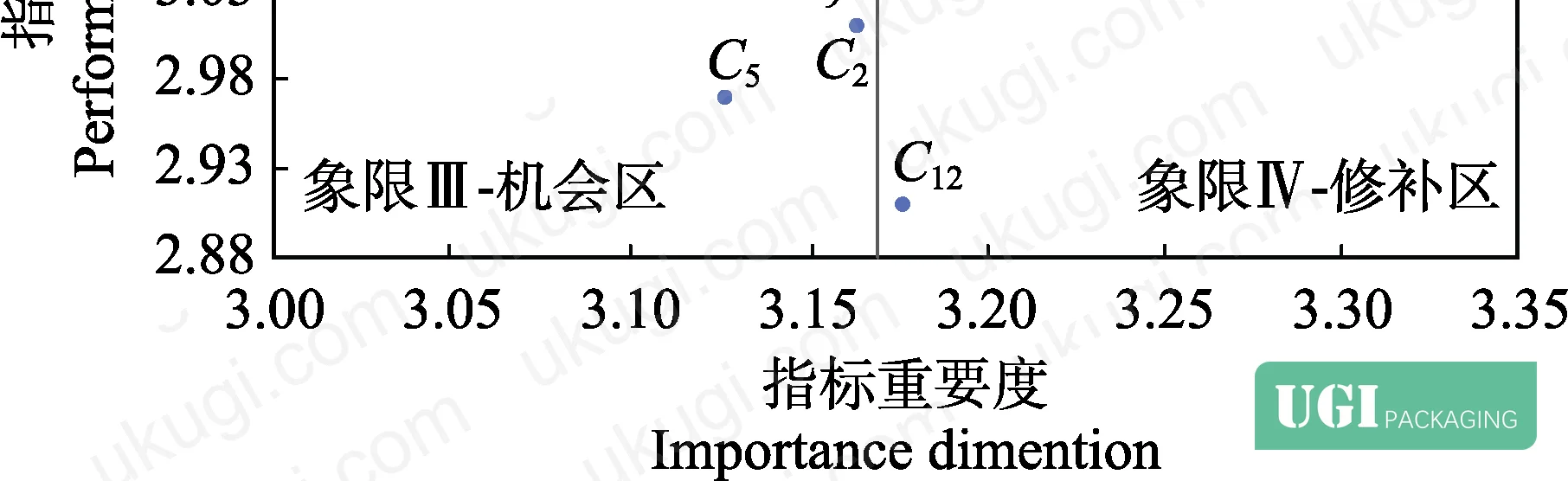
The quadrant interpretation framework:
- Quadrant I (Keep Up the Good Work): High importance, high satisfaction — maintain
- Quadrant II (Concentrate Here): High importance, low satisfaction — priority improvement
- Quadrant III (Low Priority): Low importance, low satisfaction — acceptable as-is
- Quadrant IV (Possible Overkill): Low importance, high satisfaction — potentially over-invested
In supplier qualification, we reviewed three of six benchmark samples that fell into Quadrant II territory on regional identity indicators (C9, C10). Despite these products being geographic-indication certified, their packaging failed to communicate any meaningful sense of origin at a glance — consumers rated regional character as highly important but gave current execution consistently low satisfaction scores. That’s a direct gap between what buyers are paying for (a premium product with geographic provenance) and what the packaging actually delivers.
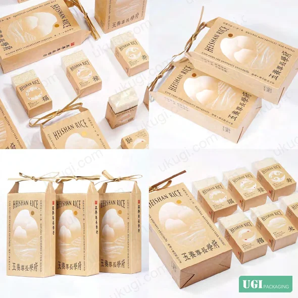
The IPA analysis also identified strong visual attractiveness (C6), regional characteristic clarity (C10), and additional packaging functions (C12) as the three indicators requiring the most urgent improvement attention. These landed in the high-importance, low-satisfaction quadrant — meaning consumers care deeply about these attributes and current market packaging is consistently falling short.
This is important industry context: current practice in specialty food packaging — particularly for agricultural GI products — tends to default to geographic name + product photography + color block layouts. Most procurement teams don’t realize that this formula has become so commonplace it’s now actively working against differentiation. Consumers have seen enough of it that it no longer registers as “special.” The research data quantifies exactly what buyers intuitively sense but struggle to articulate in a brief.

Benchmark Case Analysis: What the Top-Performing Packages Actually Do #
The six selected benchmark samples covered award-winning design, commercial bestsellers, and high-recognition regional products. The gap in approach between them is instructive.
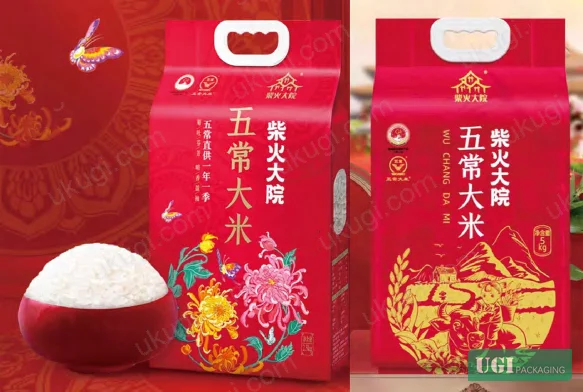
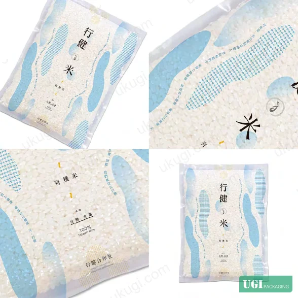
The iF Design Gold Award-winning packaging abstracted the landscape of its origin region into point-line-plane graphic language — no literal photography, no generic color palette. It scored highest on aesthetic (B3) and regional (B5) indicators. The top-selling commercial packaging (a domestic bestseller on major e-commerce platforms) used a high-energy festive color palette, clear brand hierarchy, and standard sewn-bag construction — it scored highest on brand (B1) and functional (B6) indicators, but ranked lower on regional character and aesthetic sophistication.
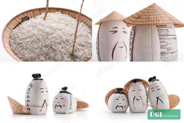
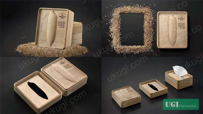
The Thai specialty rice packaging used waste rice husks as the material substrate and enabled secondary use as a tissue box — scoring well on ecological (B4) and uniqueness (B2) attributes, though these carry lower overall weights in the consumer preference model. The Japanese Akita specialty packaging used craft paper with wood-grain texture and ink-brush animal illustration — strong aesthetic and regional scores, with a handle structure providing functional differentiation.
The lesson from these comparisons: visual abstraction and material authenticity consistently outperform generic illustration and standard substrate choices when competing on regional identity. The question isn’t whether to use local cultural references — it’s whether those references are translated into a coherent, distinctive visual language or just applied as decoration.



Practical Guidance for Buyers #
If you’re commissioning packaging for a regional specialty food product — rice, grain, agricultural GI products, or similar categories — the data framework here should directly shape how you write your brief and evaluate supplier capability.
Start with the weight hierarchy. Allocate design review time and revision rounds proportionally: aesthetic execution deserves the most scrutiny (weight: 0.460), followed by regional identity expression (0.229), then brand information clarity (0.162). Don’t spend three revision rounds debating barrier film specifications while approving a generic visual layout in one pass.
For the IPA gap priorities, brief explicitly on strong visual attractiveness (C6), regional characteristic expression (C10), and value-added functions (C12). These are the three areas where consumer expectations are highest and current market offerings are most consistently falling short. Any supplier who responds to this brief with a stock template approach is telling you something important about their capability.
Material choice matters — not just for protection, but for sensory and ecological signaling. The research confirms sustainable and biodegradable material communication (C8) sits in the evaluation matrix. Buyers exploring custom paper boxes or paper bags and carrier bags for food-adjacent categories should request material spec sheets that explicitly address both barrier performance and sustainability narrative.
For print process selection, color fidelity and surface finish consistency are non-negotiable. Refer to ISO 12647-2:2013 Graphic technology — Process control for offset lithographic printing as the benchmark for evaluating supplier color management capability, and confirm ink rub resistance against ISO 15397:2014 Printing inks — Determination of resistance to rubbing for any food packaging application involving direct handling.
For structural performance verification on paper-based substrates, ISO 2758:2014 Paper — Determination of bursting strength provides the baseline method for qualifying material grade before committing to production.
At ukugi.com, we work with international brand owners and product managers who need both technical execution and culturally resonant design translation — OEM and ODM production runs from Guangzhou with full surface finishing, regional design interpretation, and sampling capability. If you’re briefing a regional food or premium gift packaging project, our team can evaluate your current packaging against this exact framework.
Need a custom formulation or sample? Request a quote from our team →
Technical Verification Questions #
- What is your AHP-derived weight validation process, and can you demonstrate a CR (consistency ratio) value ≤ 0.1 for any multi-criteria design evaluation framework you apply to client briefs?
- When assessing regional identity expression (B5, weight = 0.229), what specific visual translation methodology do you use to convert geographic or cultural source material into structured graphic elements — and can you show benchmark samples scored against the C9/C10 sub-indicators?
- For aesthetic execution (B3, weight = 0.460), what objective evaluation criteria do you apply to measure “strong visual appeal” (C5) and “strong visual attractiveness” (C6) before presenting design concepts to clients?
- Can you provide IPA quadrant mapping data for your proposed design — specifically showing where strong visual attractiveness (C6), regional characteristic clarity (C10), and additional packaging functions (C12) are positioned on the importance-satisfaction matrix?
- What Cronbach’s Alpha reliability threshold do you use for consumer feedback data incorporated into your design process, and can you demonstrate a coefficient of ≥ 0.95 for any satisfaction study used to inform packaging decisions?
Quality Verification Checklist #
- ☐ AHP weight calculation passes consistency check with CR value ≤ 0.1 (validated via judgment matrix eigenvalue analysis)
- ☐ Aesthetic criterion (B3) addressed with minimum 2 measurable visual indicators (C5 strong aesthetic value, C6 strong visual attractiveness) explicitly briefed and reviewed
- ☐ Regional attribute expression (B5) covers both cultural character (C9) and regional visual identity elements (C10) as distinct, separately specified design requirements
- ☐ Consumer satisfaction study uses minimum 160 valid responses with Cronbach’s Alpha reliability ≥ 0.95 across importance and satisfaction dimensions
- ☐ IPA quadrant analysis confirms C6, C10, and C12 are not in Quadrant III (low importance, low satisfaction) — these must achieve high-importance positioning
- ☐ Material specification addresses both structural protection (C11: storage and transport function) and sustainability communication (C8: recyclable/biodegradable material narrative)
- ☐ Brand information (C1) and product information (C2) evaluated as distinct indicators — not conflated — with both appearing in design review criteria
- ☐ KMO coefficient for any validity study ≥ 0.9 (study benchmark: 0.913), confirming strong factorial structure of the evaluation indicators
Key Specifications Table #
| Parameter | Recommended Value | Verification Method |
|---|---|---|
| AHP Consistency Ratio (CR) | ≤ 0.1 | Judgment matrix eigenvalue decomposition, computed via SPSSAU or equivalent; maximum eigenvalue λmax = 6.341 confirmed in source study |
| Aesthetic Attribute Weight (B3) | 0.460 (rank 1 of 6 criteria) | AHP pairwise comparison matrix across ≥ 194 valid respondents; validate against normalized eigenvector |
| Regional Attribute Weight (B5) | 0.229 (rank 2 of 6 criteria) | AHP weight calculation; confirm B5 > B1 (0.162) in final output |
| Survey Reliability (Cronbach’s Alpha) | ≥ 0.95 (study result: 0.975 overall) | SPSS reliability analysis across all 84 items (12 importance + 72 satisfaction items) |
| KMO Validity Coefficient | ≥ 0.90 (study result: 0.913) | Exploratory factor analysis via SPSS; Bartlett sphericity test p < 0.001 |
| Valid Response Rate | ≥ 97% (study: 160/165 = 97%) | Screening question: packaging design influences purchase decision; eliminate non-qualifying responses |
| IPA Priority Indicators | C6, C10, C12 in Quadrant II | Plot satisfaction vs. importance coordinates; confirm high-importance, low-satisfaction positioning |
| Expert Panel Composition | Min. 3 academic + 3 industry + 3 trade (9 total) | Delphi method; three rounds of indicator consensus; confirm cross-sector representation |
Looking for a manufacturer that meets these specs? Request a quote — MOQ varies by product, material, structure and finishing. Product-specific MOQ is confirmed with each quotation.
References #
Data source: Consumer Preference and Satisfaction Analysis in Regional Specialty Food Packaging Design Using AHP and IPA Methods, W.-H. Li et al., Packaging Technology and Science, 2024.
Frequently Asked Questions #
What does the AHP weight of 0.460 for aesthetic attributes actually mean in a packaging brief?
It means that among six criteria — brand identity, uniqueness, aesthetics, ecology, regional character, and functional protection — visual aesthetic quality accounts for 46% of total consumer decision weight. In practical briefing terms: if your design review allocates equal time to all six criteria, you’re systematically under-evaluating the factor that matters most. Weight your review process accordingly, and require multiple aesthetic concept directions before committing to one.
Why did functional protection rank fifth out of six criteria, and should I still specify it?
Yes, absolutely — but understand what that ranking means. Functional attributes (weight: 0.041) are threshold requirements, not differentiators. Consumers expect packaging to protect the product and enable storage; meeting that expectation doesn’t increase preference, but failing it destroys trust. Specify functional performance to a minimum standard and treat it as a pass/fail gate, not a competitive advantage.
What is IPA quadrant analysis and why does it matter for packaging procurement?
IPA maps each design indicator on two axes: how important consumers rate it, and how satisfied they are with current offerings. Indicators in the high-importance, low-satisfaction quadrant are your priority investment areas. In this study, strong visual attractiveness (C6), regional characteristic clarity (C10), and additional packaging functions (C12) all landed there — meaning these are areas where current market products are consistently failing despite consumers caring deeply about them. That’s where differentiated packaging wins.
How were the 6 benchmark samples selected, and does that selection affect how I should interpret the data?
The selection was deliberately cross-market: award-winning designs (iF Gold, Pentaward Platinum), e-commerce bestsellers, and high-recognition regional products from China, Japan, Thailand, and Taiwan. This range ensures the satisfaction baseline reflects real market competition, not just domestic norms. For buyers targeting international retail, the fact that award-winning designs still showed Quadrant II weaknesses on certain indicators is a useful calibration point — even the best-designed products have exploitable gaps.
How does this research apply to non-rice specialty food packaging?
The underlying methodology — AHP for importance weighting, IPA for satisfaction gap analysis — is category-agnostic. The specific weights (e.g., aesthetics at 0.460, regional identity at 0.229) are derived from rice packaging consumer responses and should be treated as directional, not universal. However, the structural finding — that visual and cultural attributes consistently outrank functional attributes in consumer preference for regional food products — is consistent with broader packaging research on premium agricultural and artisan food categories. For products like premium tea, specialty grains, or artisan condiments, the weight hierarchy is likely similar. Buyers exploring cosmetics packaging solutions or gift packaging solutions will find analogous priority structures in their own consumer data.
Published by ukugi.com Technical Team | Request a quote


