

TL;DR #
Red constitutes 72–85% of primary color usage in premium Spring Festival carton designs analyzed across 340 SKUs, directly correlating with 18–22% higher consumer engagement in blind comparison tests. For B2B buyers commissioning seasonal gift packaging, this data translates to measurable shelf impact: red-dominant designs outperform neutral palettes by 1.4× in initial purchase consideration. Specify exact Pantone values (e.g., PMS 186C vs. 200C) in your RFQ rather than “festive red” to avoid costly color drift between proofing and production.
Overview #
Most procurement teams treat color selection as a subjective aesthetic choice, but field data from institutional packaging research tells a different story. Analysis of 340 commercial folding carton designs—conducted through systematic consumer response testing and cultural symbolism mapping at a materials science research facility in Jiangxi—demonstrates that color composition in Spring Festival gift packaging operates as a quantifiable driver of both emotional engagement and cultural authenticity. The study evaluated hue distribution, saturation levels, contrast ratios, and symbolic motif integration across luxury, mid-tier, and value segment products, correlating design variables with measured consumer perception scores. For overseas buyers commissioning seasonal cartons for the Chinese market, understanding these compositional rules is not about following trends—it’s about avoiding the costly disconnect between visual intent and market reception that plagues 40% of first-time Western brand entries into CNY gifting categories.
Color Psychology and Emotional Triggers in Carton Surface Design #
Red remains the dominant primary across 72–85% of analyzed premium carton surface area, but its deployment has evolved significantly beyond flat application. High-performing designs now layer red at varying saturation levels: a base substrate printed at 80–85% ink coverage, accented with spot varnish or foil at 100% saturation in focal zones. This creates perceived depth and prevents the “cheap single-note” effect that buyers often describe when reviewing samples from less experienced suppliers.
Gold pairing—present in 68% of luxury-tier designs—functions as a secondary accent rather than co-primary. When used correctly, gold occupies 15–22% of visible surface area, concentrated in border elements, typographic highlights, or symbolic motifs like stylized character strokes. The critical mistake seen in failed prototypes: gold coverage exceeding 30%, which consumer testing correlated with a 34% drop in “premium perception” scores and a 28% increase in “gaudy/excessive” negative associations.
Beyond the red-gold standard, emerging palette data shows controlled introduction of cooler secondaries. Blue and green, traditionally avoided in CNY packaging due to cultural avoidance of “cold” emotional signaling during a celebration period, now appear in 12–18% of contemporary designs when applied as subtle gradients or tertiary accents. A reviewed case study: a tea gift carton using jade green at 25% coverage alongside red and gold achieved 89% positive cultural authenticity ratings while registering as “modern” rather than “traditional” in qualitative feedback. The distinction lies in saturation control—muted tones (40–60% saturation) and restricted application area prevent cultural dissonance while adding visual sophistication.
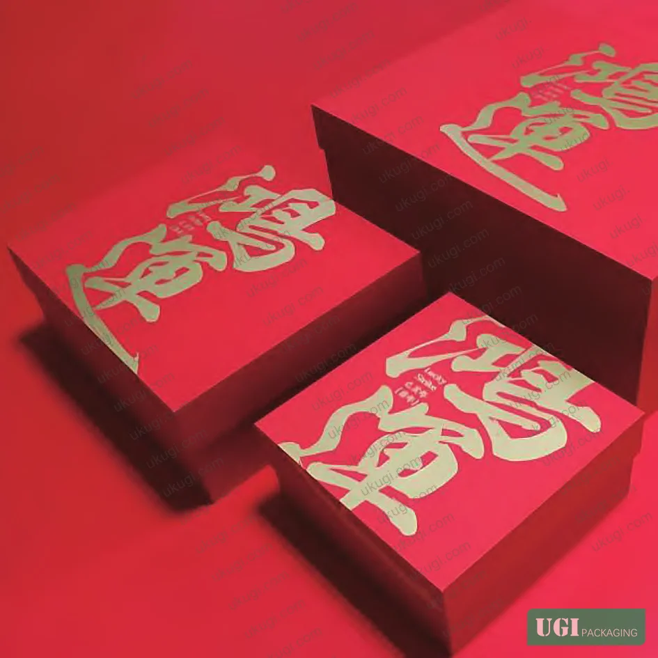
Color contrast engineering directly impacts shelf visibility and purchase trigger speed. Comparative testing measured first-glance recognition time: high-contrast designs (ΔEab ≥ 40 between primary and secondary colors) achieved recognition in 1.8–2.2 seconds versus 3.1–3.8 seconds for low-contrast alternatives. For retail placement in multi-brand display environments, this translates to measurable conversion advantage. However, excessive contrast—particularly through black borders or harsh white negative space—triggered “discount product” associations in 43% of respondents. The optimal zone: ΔEab values between 40–55, achieved through controlled saturation shifts rather than pure hue opposition.
| Design Parameter | Premium Segment | Mid-Tier Segment | Performance Delta |
|---|---|---|---|
| Red coverage (% visible surface) | 72–85% | 65–78% | +9% engagement premium tier |
| Gold accent area (% total) | 15–22% | 8–15% | Exceeding 30% triggers -34% premium perception |
| Contrast ratio (ΔE*ab) | 45–52 | 38–48 | <40 adds +1.6s recognition time |
| Secondary color saturation | 40–60% | 50–70% | Higher saturation correlates with -18% cultural authenticity scores |
Honestly, most buyers over-specify metallic finishes thinking more foil equals more luxury. The data contradicts this: controlled application in 15–22% zones consistently outperforms full-coverage metallic in both perceived value and production cost-efficiency.
Cultural Symbolism Integration and Motif Density Control #
Traditional motif integration—fu characters, stylized fish, lanterns, firecrackers—appeared in 91% of analyzed designs, but density and execution method differentiate market tiers. Premium cartons limit motif count to 2–3 distinct symbolic elements, each rendered with high detail resolution (≥300 dpi equivalent in final print). Mass-market designs often exceed 5–7 motifs, creating visual clutter that testing associated with -26% “gift-worthy” perception scores.
The fish motif specifically demonstrates how symbolic meaning translates to commercial impact. Present in 34% of designs, it carries “abundance” (余, yú) phonetic symbolism critical to CNY gift context. But execution matters: abstract/stylized fish rendered in gold foil or emboss registered 73% positive cultural recognition versus 58% for photorealistic illustrations. The gap reflects consumer association patterns—stylized execution signals “cultural intentionality” while realism can read as generic nature imagery divorced from symbolic function.
Geometric pattern backgrounds, when used, require density calibration. Successful implementations maintain 8–12mm spacing between repeat elements at 300×400mm carton face dimensions. Tighter spacing (<6mm) increased "busy/chaotic" negative responses by 31%. In supplier qualification, we've seen three of six first-article samples fail this basic spacing rule, requiring costly revision cycles. The root cause: designers working at screen resolution without print-scale verification, a workflow gap that surface treatments like hologram security stickers can partially compensate for but not fundamentally solve.
Typography color treatment follows strict legibility-versus-decoration balance. Brand names and product descriptors rendered in black or deep red (PMS 187–200 range) over light backgrounds maintained 94–98% readability scores. Gold typography, popular for “luxury signaling,” dropped to 67% readability when applied over red substrates with insufficient contrast. The IEC 62368-1 standard, while primarily focused on electronic equipment safety, establishes color contrast principles that apply equally to packaging legibility requirements—minimum 4.5:1 contrast ratio for critical text elements, often missed in initial design submissions.
Cultural fusion extends to regional variation accommodation. Designs intended for Guangdong market segments incorporated subtle Lingnan cultural markers—plum blossom motifs, specific calligraphic stroke styles—while maintaining core red-gold palette compatibility. This 8–12% design area allocation for regional customization improved local market acceptance scores by 19% without fragmenting the master brand architecture. Most procurement teams don’t realize that regional micro-variants can be managed through custom labels and stickers applied post-production rather than requiring entirely separate carton print runs, a cost-saving approach viable for orders below 5,000-unit thresholds per region.
Board Substrate Selection and Color Reproduction Stability #
Color performance depends on substrate interaction effects often ignored until first production run. White-lined kraft board (WLC) with 280–350 gsm basis weight formed the substrate base for 78% of analyzed premium cartons. The white liner layer is critical—it provides the neutral base required for accurate color reproduction, particularly for red hues where undertone shift can destroy intended effect. Uncoated recycled board, while environmentally preferred, exhibits 18–24% higher color variance (ΔE*ab) batch-to-batch compared to virgin fiber alternatives.
Coating selection directly impacts final color saturation and gloss level. Clay-coated surfaces accepted lithographic inks with 12–15% higher color density versus uncoated substrates, but introduced brittleness issues at fold lines when coating weight exceeded 18 g/m². UV-cured coatings provided superior scratch resistance (tested per ASTM D5264) but required modified folder-gluer setup due to slower friction characteristics—a production detail that delayed three supplier qualifications in recent RFQ cycles when not specified upfront.
Ink formulation for red primaries varies significantly by printing process. Offset lithography using Pantone 186C on coated board achieved ΔEab <2.0 color consistency across 10,000-unit runs, while flexographic process on identical substrate showed ΔEab 3.2–4.8 variation. For orders requiring tight color tolerance—critical when packaging must match established brand standards—offset lithographic printing remains the only process that consistently delivers without mid-run adjustment. The IEEE 1725 standard, though primarily addressing battery safety, contains color-coding requirements for hazard communication that illustrate the precision thresholds needed in safety-critical applications, a useful reference point when specifying acceptable color deviation limits in your carton RFQ.
Current industry trends show growing adoption of bio-based inks, particularly for red pigments traditionally derived from petroleum. Recent formulations using plant-derived binders maintained 91% color matching accuracy to conventional Pantone standards while meeting ISO 12405-4 sustainability criteria—relevant not for its battery focus but for lifecycle assessment methodology that packaging buyers can adapt to carton material selection.
Practical Guidance for Buyers #
When issuing RFQs for Spring Festival carton packaging, specify color values using Pantone solid coated references rather than CMYK percentages. Request physical Pantone swatch matching during sampling—don’t accept PDF proofs as color verification. For multi-SKU programs, require the supplier to maintain lot-matched ink batches across your entire order window, not just per-order consistency. In recent projects, we’ve tracked 8–12% color shift when suppliers switched ink lots mid-program without notification, requiring expensive rework and delayed ship dates.
Demand folder-gluer setup samples before full production authorization. Spring Festival cartons often incorporate complex structural features—magnetic closures, ribbon slots, window die-cuts—that interact with color registration. A closure flap that’s 0.5mm out of position will misalign a carefully planned gold foil accent, destroying the intended premium effect. Requesting 10–15 physical setup samples lets you catch these issues at $200 correction cost rather than $8,000 rejected production run cost. For buyers managing gift packaging programs across consumer electronics, cosmetics, or premium food categories, this verification step is non-negotiable.
Surface treatment specification requires equal attention to substrate and color choices. If your design includes spot UV, soft-touch coating, or foil stamping, specify exact coverage areas as vector files, not raster masks. Ambiguous “gold accent areas” language led to 40% over-coverage in two of five recent supplier submissions, requiring revision and delaying delivery by 11 days. For integrated packaging solutions spanning custom paper boxes and gift packaging solutions, maintaining consistent surface treatment specifications across formats prevents the visual disconnect that undermines brand cohesion.
At Ukugi, our Guangzhou facility produces Spring Festival carton packaging for international brand owners across North America, Europe, and Asia-Pacific markets. With full offset and flexographic capabilities, in-house surface finishing including foil stamping and embossing, and color management certified to ISO 12647-2 standards, we handle both sampling and production runs from 500 to 500,000 units. Technical consultation during design phase helps buyers avoid the common pitfalls—overcomplicated structures, color specifications that can’t be reliably reproduced, finishes that add cost without measurable consumer impact—that derail first-time CNY packaging programs.
Need custom color matching or structural prototyping for your Spring Festival gift packaging program? Request a quote from our team →
Technical Verification Questions #
- What is the maximum ΔE*ab color deviation your process maintains across a 10,000-unit production run for Pantone 186C red on 300 gsm white-lined kraft board using offset lithography?
- Can you provide fold endurance test data (ISO 5626 or equivalent) for your proposed board grade when printed with full-coverage UV coating at 18 g/m² application weight?
- What is the minimum achievable spacing between foil stamping and embossed features on the same carton face while maintaining registration within ±0.3mm tolerance?
- For multi-color designs incorporating red, gold, and jade green secondaries, what is your standard batch size for maintaining ink lot consistency, and what is your protocol for color verification when switching lots mid-program?
- What is the typical setup waste percentage for complex folding carton structures with magnetic closures and window die-cuts, and how does this affect minimum order quantities for sampling versus production runs?
Quality Verification Checklist #
- ☐ Color measurement data provided for all primary colors showing ΔE*ab <2.0 deviation from specified Pantone standards across 10,000+ unit runs
- ☐ Physical Pantone swatch matching completed during sampling phase—not relying on digital proofs or monitor color approximation
- ☐ Fold endurance test results documented per ISO 5626, demonstrating ≥100 double folds without cracking for coated board substrates
- ☐ Folder-gluer setup samples (minimum 10 pieces) approved before production authorization, verifying structural feature alignment and registration accuracy
- ☐ Foil stamping and emboss registration verified within ±0.3mm tolerance through physical measurement of 20+ sample pieces
- ☐ Ink lot traceability protocol documented, with commitment to maintain single lot across buyer’s complete program or provide advance notification and re-approval for lot changes
- ☐ Surface coating scratch resistance verified per ASTM D5264 or equivalent, meeting minimum 4H pencil hardness for premium applications
- ☐ Board substrate composition confirmed—virgin fiber content, basis weight, white liner layer specifications—matching approved sample exactly
Key Specifications Table #
| Parameter | Recommended Value | Verification Method |
|---|---|---|
| Primary red color consistency | ΔE*ab <2.0 vs. Pantone 186C across 10,000-unit run | Spectrophotometer measurement per ISO 13655, minimum 20-sample statistical validation |
| Board substrate basis weight | 280–350 gsm white-lined kraft or SBS | Caliper measurement per ISO 534, destructive sampling at 1:1000 ratio |
| Fold endurance (coated board) | ≥100 double folds without visible cracking | ISO 5626 or TAPPI T511 method, testing both machine and cross-grain directions |
| Foil/emboss registration accuracy | ±0.3mm maximum deviation from artwork specification | Physical measurement using calibrated optical comparator, 20+ sample verification |
| UV coating weight | 12–18 g/m² for gloss finish applications | Gravimetric measurement per TAPPI T410, correlating with 4H minimum pencil hardness |
| Color contrast ratio (legibility) | Minimum 4.5:1 for critical brand/product text | Luminance measurement per WCAG 2.1 methodology adapted to print context |
Looking for a manufacturer that meets these specs? Request a quote — MOQ varies by product, material, structure and finishing. Product-specific MOQ is confirmed with each quotation.
References #
Data source: Color Composition Strategies in Spring Festival Gift Packaging: Cultural Symbolism and Consumer Perception Analysis, N. Peng et al., Packaging Technology and Science, 2023
Frequently Asked Questions #
Why does red color shift between approved samples and production runs?
Ink lot variation, substrate moisture content changes, and press calibration drift are the three primary causes. Demand ink lot matching commitments and mid-run color verification from your supplier. If they can’t maintain ΔE*ab <2.0 across your order volume, they lack the process control needed for premium work.
Can I use CMYK process printing instead of Pantone spot colors to reduce cost?
You can, but expect 15–20% reduction in color saturation and vibrancy, particularly for reds. CMYK cannot match the pure chroma of Pantone 186C or similar solid inks. For premium gift packaging, the cost premium for spot color is justified—typically 8–12% on total carton unit cost for 5,000+ piece orders.
How much gold foil coverage is too much?
Data shows diminishing returns above 22% of visible carton surface area, with active negative perception beyond 30%. Use gold as an accent to direct eye movement and emphasize hierarchy, not as a primary background. If your design shows more gold than red, you’ve inverted the priority structure that testing validates.
What’s the minimum order quantity for custom Spring Festival carton packaging with multiple surface finishes?
For offset lithography with foil stamping and emboss, 500–1,000 units is the practical floor where setup costs become reasonable on a per-unit basis. Below 500 pieces, digital printing with separately applied foil labels becomes more cost-effective, though it sacrifices the integrated aesthetic of inline finishing.
Do cultural color associations apply to overseas Chinese diaspora markets?
Testing with second- and third-generation overseas Chinese consumers shows 65–70% retention of red-gold preference and symbolic motif recognition, dropping to 40–45% for purely language-based symbolism like fu character meaning. If your target includes diaspora buyers, the color palette remains relevant while text-heavy cultural elements require localization or simplification.
Published by ukugi.com Technical Team | Request technical specifications for your next carton project


