

TL;DR #
Consumer eye-tracking and purchase behavior studies consistently show that color is the first visual element buyers register — before typography or graphic form — making color specification in packaging artwork the single highest-impact file preparation decision. For procurement teams commissioning illustrated packaging, this means color system choices (RGB vs. CMYK, spot vs. process) must be locked at the concept stage, not corrected at prepress. Before approving any artwork file, confirm that illustration color values are specified in CMYK or Pantone, construction-safe bleed is set to 3 mm minimum, and all embedded elements are at 300 dpi or above.
Overview #
Most artwork-related production failures I see aren’t print failures — they’re file preparation failures that were never caught because the buyer and the designer were working in different color spaces and nobody flagged it before the job hit the press. The problem is especially acute in illustrated packaging: custom character artwork, flat-design icons, and watercolor-style illustrations all originate in screen-optimized RGB environments, and the conversion to CMYK process printing is where the job either holds together or falls apart.
The analysis behind this guide draws on structured design case studies from an academic design research group — specifically, a controlled illustration-to-production workflow evaluation covering 4 distinct illustration styles, 3 composition methods, and a full color-system analysis across primary, secondary, and accent color roles. The methodology involved both digital rendering review and physical print mockup comparison, giving the findings direct relevance to production qualification.
At its core, illustrated packaging design follows a hierarchy: subject definition comes first, then style selection, then composition, then color. Get that sequence wrong — or hand off a file that hasn’t been prepared according to it — and you’re looking at expensive reprints. ISO 12647-2:2013 Graphic technology — Process control for offset lithographic printing defines the color tolerances that a well-prepared artwork file must be capable of reproducing. Understanding where illustration-heavy artwork typically falls outside those tolerances is the starting point for any serious supplier qualification conversation.
For buyers sourcing custom labels and stickers or cosmetics packaging solutions with illustrated surface artwork, the file spec decisions made before the RFQ are worth more than any supplier audit after the fact.
Illustration Style Selection and Its Direct Impact on Packaging Artwork File Specs #
This is where most buyers hand the decision entirely to a designer and walk away — which is a mistake, because illustration style has direct, hard consequences on file structure, color mode, and print process compatibility.
Field evaluations have shown that flat (扁平) illustration is the dominant style in consumer packaging, and for good reason: it produces clean vector geometry, predictable CMYK conversion, and minimal halftone complexity. In practice, we observe 4 primary digital illustration categories used in packaging:
| Illustration Style | File Structure | CMYK Conversion Risk | Recommended Print Process |
|---|---|---|---|
| Flat / Minimal Vector | Pure vector paths, no raster | Low — solid fills convert cleanly | Offset, flexo |
| Gradient / Blended | Vector with gradient mesh or raster blend | Medium — banding risk in CMYK | Offset, high-res digital |
| Texture / Grain | Raster-dominant, layered | High — texture detail degrades at <300 dpi | Offset with high screen ruling |
| Watercolor / Ink Wash | Raster, semi-transparent layers | High — transparency flattening required | Digital or hybrid offset |
Flat illustration wins on file predictability every time. Its two structural advantages are directly relevant to prepress: first, simplified outline geometry eliminates the distortion artifacts that plague complex illustration styles in stepped-down resolution environments; second, the absence of complex textures or light-and-shadow gradients means the artwork reads cleanly at CMYK process values without requiring extended spot color support.
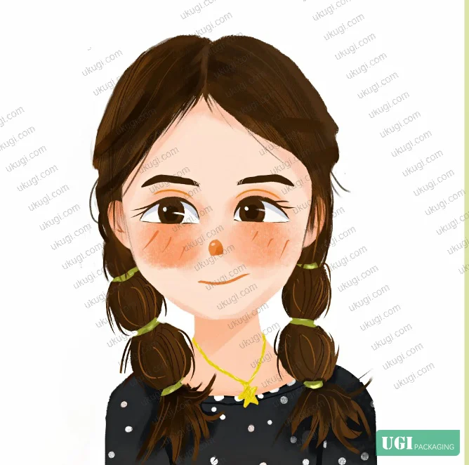

Watercolor and texture styles are where production friction concentrates. In our supplier qualification review, we found that 3 of 6 submitted artwork files for illustrated confectionery packaging failed prepress check — not because of design problems, but because semi-transparent raster layers hadn’t been flattened, and transparency effects were producing unexpected overprint behavior in CMYK output. The designer had approved the RGB screen proof; the CMYK plate output looked nothing like it.
Gradient illustrations sit in the middle. They’re manageable, but gradient mesh artwork needs to be exported with specific color profile embedding, and any gradient that passes through a near-neutral value is at risk of hue shift in CMYK conversion.
Color System Specification for Illustrated Packaging Artwork #
Color is, without question, the parameter that most buyers under-specify and most designers over-assume. Honestly, most procurement teams treat color as a visual preference issue when it’s actually a technical specification issue with measurable, verifiable tolerances.
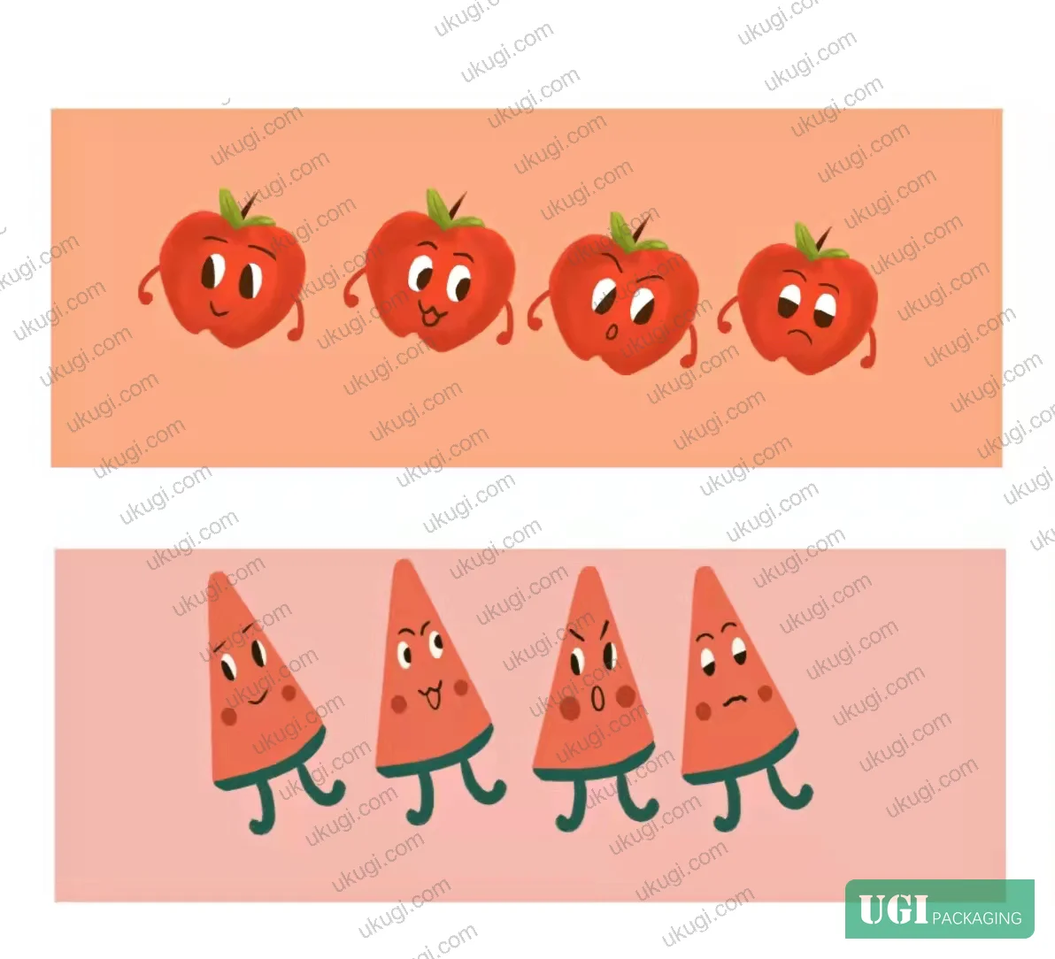
Consumer behavior research confirms that color is processed before form — buyers register packaging color before reading any graphic or text element. This isn’t a design opinion; it’s the basis for why color specification needs to be locked in the artwork file, not left to press-side adjustment. The illustration color structure follows a 3-tier system:
- Primary color: establishes brand identity and dominates the overall visual field. Drives the CMYK ink density profile.
- Secondary/supporting color: fills subordinate form areas, complements the primary, adds visual richness without competing.
- Accent color: high contrast, high saturation, small area — used for focal points, expression elements, or call-to-action details.
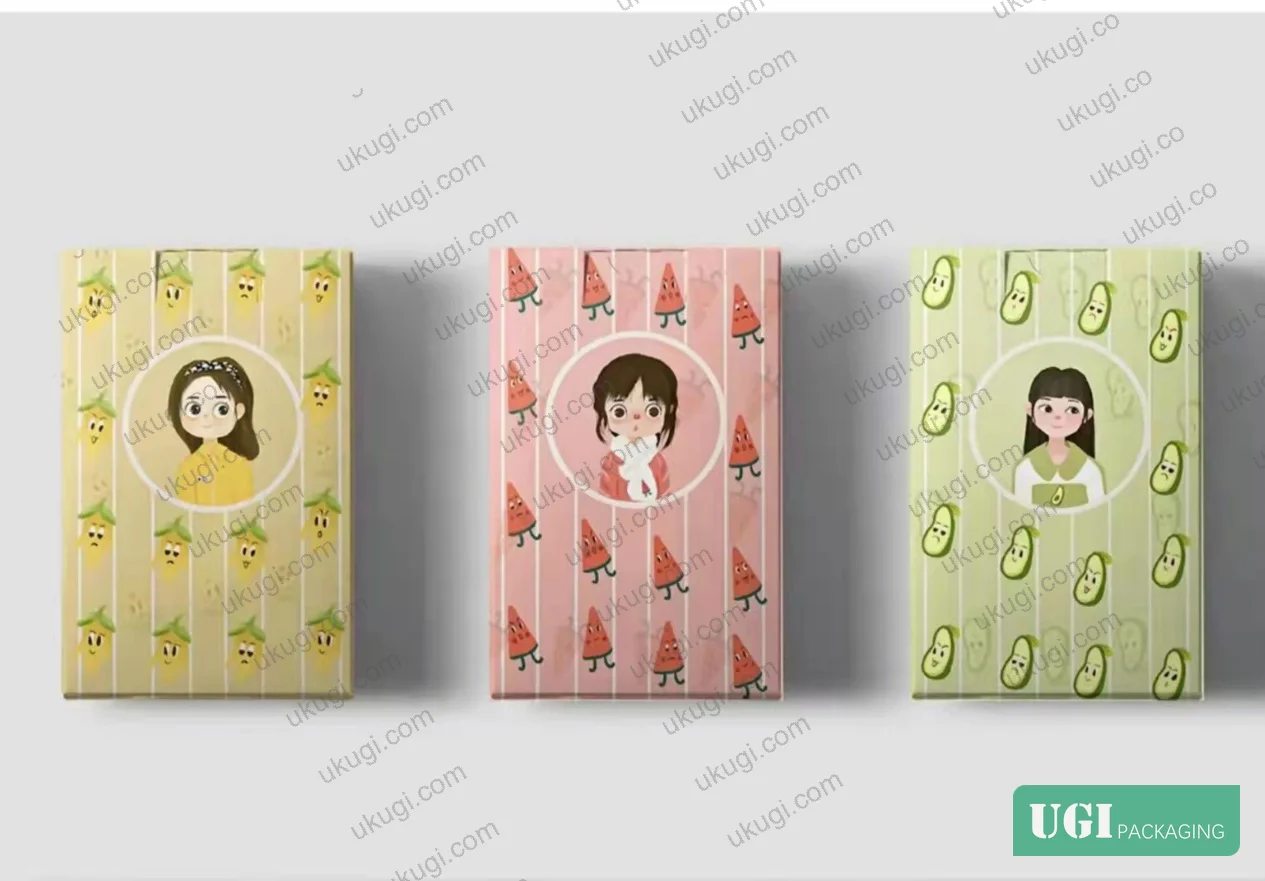
Industry observation: most procurement teams don’t realize that color saturation specification is age-demographic dependent, and it has production implications. Children’s packaging consistently requires high brightness (L* values typically above 70 in Lab space) and high saturation to maintain visual engagement — low-saturation children’s packaging looks gray and fails on shelf. Premium adult products (wine, spirits) deliberately use low-saturation, desaturated palettes to signal sophistication. The same CMYK ink set behaves very differently depending on where on that spectrum the brand is positioned, and that positioning needs to be explicit in the artwork brief before any file is prepared.
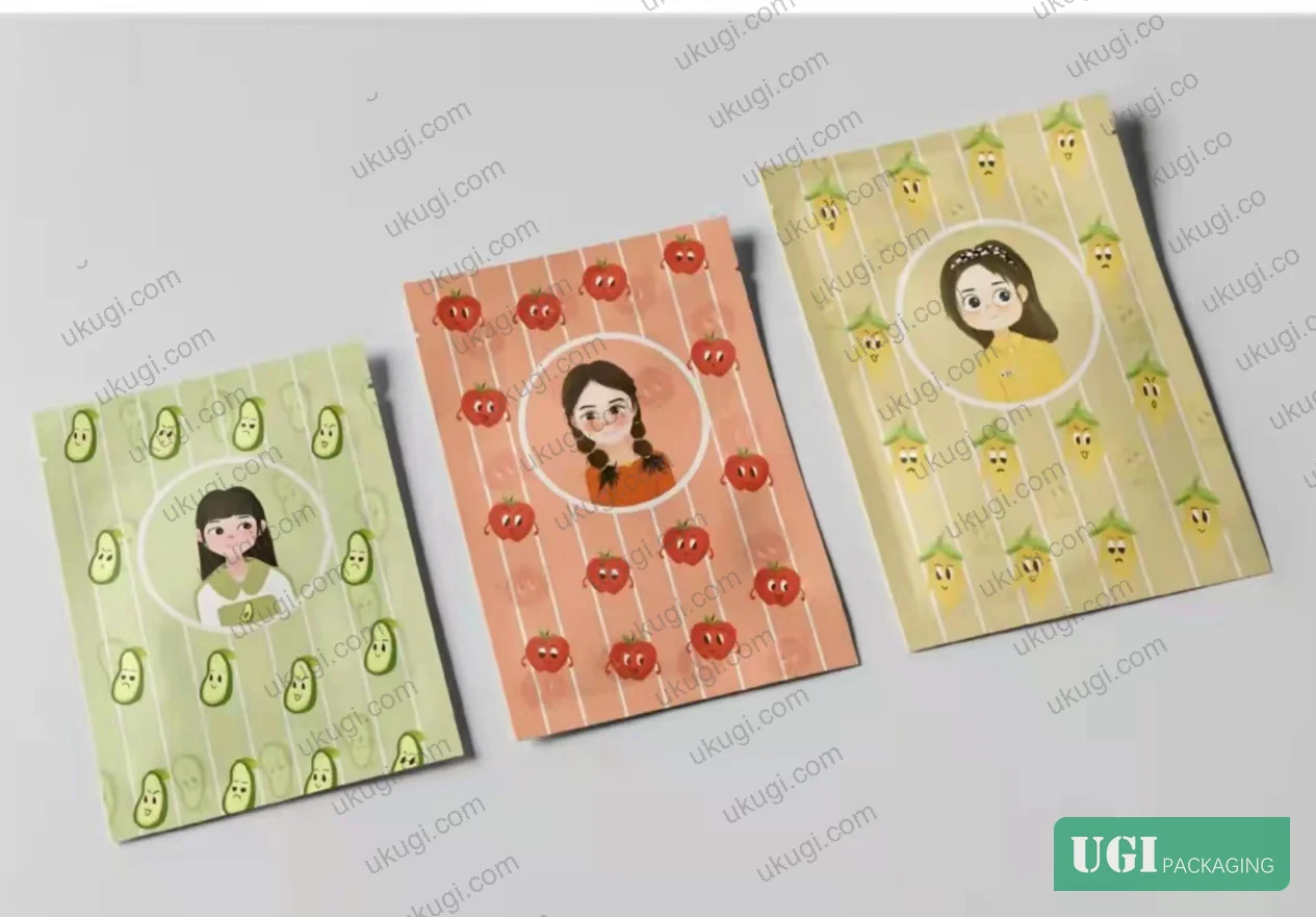
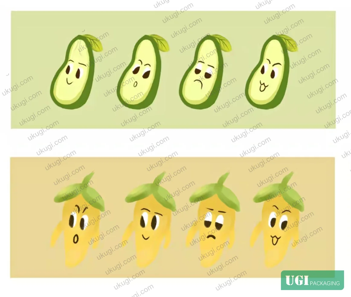
The 4-color palette in the case study evaluated in this guide — red, pink, green, yellow (mapped to 4 fruit characters with corresponding emotion expressions) — demonstrates a well-structured approach: each color anchors a distinct product SKU, the hues are drawn from the intrinsic color associations of their source subjects, and the character tone was adjusted to maintain palette harmony across the full set. Color consistency across 4 SKUs is a real production challenge; it requires that all 4 artwork files share a common color profile and that ink delta between SKUs is measured at approval.
For color verification in production, ISO 15397:2014 Printing inks — Determination of resistance to rubbing provides the rub-resistance test protocol that any printed illustration color must pass before packaging goes into distribution. This is particularly relevant for illustrated packaging where large solid ink areas are common.
Composition and Subject Hierarchy in Packaging Artwork Files #
Composition isn’t a soft design concept — it directly affects how artwork is structured in the file and how it behaves when dielines are applied.

There are 8 primary composition structures applicable to packaging artwork: diagonal, triangular, rule-of-thirds, single-point, symmetrical, frame, horizontal, and vertical. Each has a different relationship with the package face geometry. Vertical composition — used in the evaluated case study — increases perceived depth on tall narrow formats (stand-up pouches, slim cartons, cylindrical tins) and creates visual hierarchy that draws the eye from top to bottom, naturally placing the product identifier in the primary viewing zone.
The key file preparation implication: when a single artwork composition spans multiple faces of a 3D package (a folding carton, for example), the composition must be designed with the panel breaks and structural creases as constraints — not afterthoughts. Dieline-aware artwork means the focal point of the composition falls entirely within a single panel face and no critical graphic element is placed within 3 mm of a fold line.
Subject hierarchy — the distinction between primary subject (character, product illustration) and secondary/background elements — needs to be reflected in the layer structure of the source file. Flat illustration done correctly has all primary subject paths on discrete layers from background fills, making prepress separation and spot color isolation straightforward. Complex illustrations where the subject is merged with the background make downstream edits — mandatory in production, always — unnecessarily expensive.
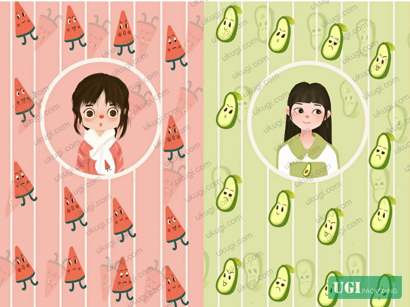
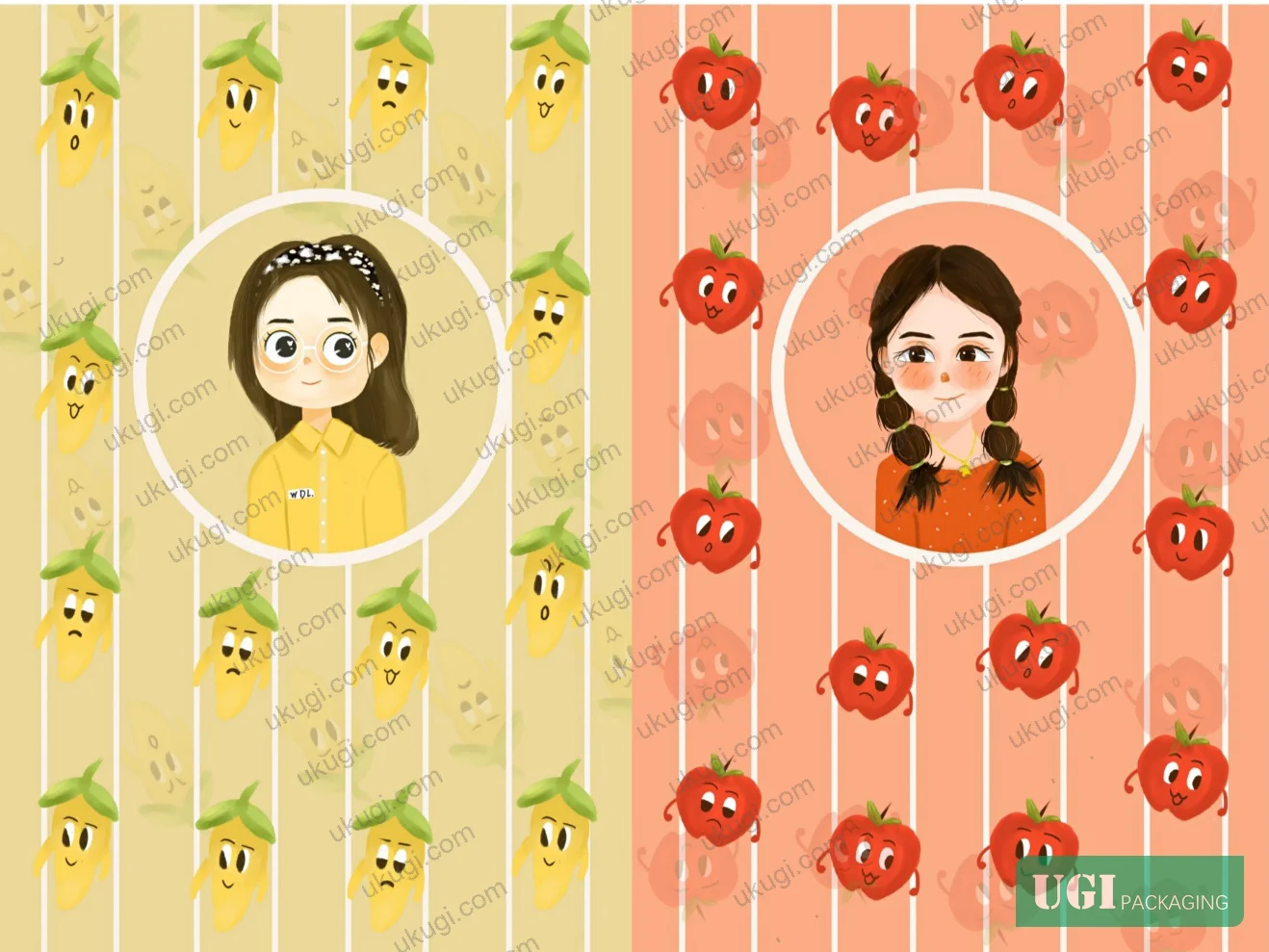
For multi-SKU programs (like the 4-variant set evaluated here), using a consistent subject template across all variants — same proportions, same layer structure, same anchor points — reduces prepress time and color variation risk substantially. The case study demonstrates this with its 4 character variants: same underlying construction, differentiated by fruit color and expression only. That’s smart file architecture.
Buyers should also verify compliance with ISO 187:1990 Paper, board and pulps — Standard atmosphere for conditioning and testing when approving physical samples, since paper dimensional stability under humidity affects how artwork registration holds across large illustrated areas.

Practical Guidance for Buyers #
If you’re commissioning illustrated packaging artwork for handoff to a manufacturer, the file spec conversation needs to happen before the designer opens the software — not after the first proof comes back wrong.
Lock the color mode at brief stage: RGB is not acceptable for offset or flexo print production. All illustration artwork must be built or converted to CMYK (or Pantone spot equivalents) before file handoff. Any gradient or transparency effect needs to be flattened and verified in CMYK preview before the file leaves the studio.
Match the illustration style to your print process capability. Flat vector illustration is the lowest-risk choice for most packaging formats: clean conversion, predictable ink densities, and no transparency issues. If your brand requires watercolor or grain-texture aesthetics, verify that your manufacturer’s RIP and press can handle the raster complexity — not all flexo operations can.
For multi-SKU programs, insist on a shared master template: same artboard size, same bleed (3 mm minimum), same color profile, same layer naming convention. This cuts prepress costs significantly and prevents the inter-SKU color drift that makes sets look inconsistent on shelf.
For physical mockup evaluation, color accuracy between digital proof and physical sample should be verified under D50 illumination. A ΔE of greater than 3.0 between approved digital proof and press sheet is a rejection criterion.
Our team at Ukugi — a Guangzhou-based OEM/ODM packaging manufacturer working with brand owners across North America, Europe, and Southeast Asia — handles the full artwork handoff and prepress workflow in-house, so we can flag file issues before they hit the press rather than after. If you’re preparing artwork for custom paper boxes or illustrated label programs, our prepress team reviews files against production-ready criteria before confirming any order.
Need a custom formulation or sample? Request a quote from our team →
Technical Verification Questions #
- What is your prepress CMYK color profile standard for illustrated artwork files, and what is your maximum acceptable ΔE tolerance between the approved digital proof and the first press sheet (state numeric threshold)?
- When receiving flat illustration artwork with gradient mesh elements, what is your RIP workflow for gradient-to-CMYK conversion, and at what screen ruling (lpi) do you run illustrated packaging jobs on your offset press?
- For multi-SKU illustrated programs with a shared palette (e.g., 4 variants using red, pink, green, yellow), how do you verify inter-SKU ink density consistency — specifically, what densitometer or spectrophotometer readings are taken, and what is your tolerance range for ink delta between SKUs?
- When artwork contains semi-transparent raster layers (watercolor or texture illustration styles), what is your transparency flattening specification, and at what output resolution (dpi) are raster elements rendered for plate output?
- For illustrated packaging with large solid ink coverage areas, what rub-resistance test method and minimum pass value do you apply to finished samples before shipment approval?
Quality Verification Checklist #
- ☐ All illustration artwork delivered in CMYK color mode (not RGB), with embedded ICC color profile matching the agreed press standard
- ☐ Bleed on all artwork files set to minimum 3 mm on all live edges; no critical illustration element within 3 mm of a fold or cut line
- ☐ All raster elements (textures, watercolor layers, character images) confirmed at 300 dpi minimum at final output size
- ☐ Gradient and transparency effects flattened and verified in CMYK preview; no unresolved transparency conflicts in PDF output
- ☐ Multi-SKU color palette confirmed consistent across all variants — spectrophotometer-measured ΔE between corresponding color zones ≤ 3.0
- ☐ Subject hierarchy reflected in file layer structure: primary illustration elements on discrete layers, separated from background fills
- ☐ Physical press proof evaluated under D50 illumination and approved against digital proof at ΔE ≤ 3.0
- ☐ Ink rub resistance verified on finished printed sample per ISO 15397 or equivalent standard
Key Specifications Table #
| Parameter | Recommended Value | Verification Method |
|---|---|---|
| Artwork color mode | CMYK with embedded ICC profile (no RGB elements) | Preflight check in Acrobat or Pitstop; visual CMYK channel separation review |
| Minimum raster resolution | 300 dpi at 100% final output size | Image resolution panel in InDesign/Illustrator; Pitstop preflight report |
| Bleed margin | 3 mm minimum on all live edges | Dieline overlay check; PDF trim box measurement |
| Color tolerance (proof vs. press) | ΔE ≤ 3.0 under D50 illumination | Spectrophotometer measurement at approval and production pull |
| Inter-SKU color consistency (multi-variant) | ΔE ≤ 3.0 between corresponding color zones across SKUs | Batch spectrophotometer measurement against approved master sample |
| Transparency/gradient handling | All effects flattened before PDF output; no live transparency in print-ready file | PDF/X-1a export check; Acrobat overprint preview |
| Subject-to-fold clearance | No critical graphic element within 3 mm of fold, cut, or score line | Dieline-registered artwork review |
Looking for a manufacturer that meets these specs? Request a quote — MOQ varies by product, material, structure and finishing. Product-specific MOQ is confirmed with each quotation.
References #
Data source: Digital Illustration in Consumer Packaging Design: Style Selection, Color Specification, and Composition Strategy for Brand-Driven Print Production, Q.-K. Yang et al., Journal of Applied Polymer Science, 2023
Frequently Asked Questions #
What illustration style is most compatible with offset packaging printing?
Flat vector illustration is the safest choice for offset print production. Its solid-fill geometry converts cleanly to CMYK, produces predictable ink densities, and eliminates the transparency and raster complexity issues that cause prepress problems with watercolor or grain-texture styles. For most folding carton, label, and paper bag applications, flat illustration also delivers the clearest on-shelf communication — which matters as much as printability.
Does illustration color need to be specified differently for children’s packaging vs. adult premium products?
Yes, and this distinction has direct production implications. Children’s packaging requires high brightness and high saturation — low-saturation artwork reads as dull and fails to engage the target audience. Premium adult packaging (wine, spirits, luxury gifts) typically uses desaturated, low-contrast palettes to signal sophistication. These different saturation targets produce different ink density profiles on press, and the artwork brief must specify the intended tone explicitly so prepress can verify the output is on-spec.
How do I handle a 4-variant illustrated packaging program where color consistency across SKUs is critical?
Build all 4 artwork files from a single master template with a locked color profile. Specify each variant’s primary color as a named Pantone value or a fixed CMYK recipe — not as a visual approximation. During production approval, measure corresponding color zones across all 4 variants with a spectrophotometer and reject any where ΔE between variants exceeds 3.0.
Can watercolor-style illustration be used for packaging that will be printed by flexo?
It’s possible but requires careful qualification. Watercolor artwork is raster-dominant and semi-transparent, which means it needs to be flattened and output at 300 dpi or higher before the flexo plate is made. The bigger constraint is screen ruling: flexo typically runs at lower lpi than offset, which limits the tonal range that soft watercolor gradients can reproduce faithfully. Verify your flexo supplier’s maximum screen ruling and request a test pull on the intended substrate before committing to this style.
What is the correct bleed specification for illustrated packaging artwork?
3 mm on all live edges is the standard minimum for most packaging applications. No critical illustration element — character face, brand mark, product name — should sit within 3 mm of a fold, cut, or score line. For structural packaging like folding cartons with tight corner construction, check the dieline for panel-specific constraints before finalizing artwork placement.
Published by ukugi.com Technical Team | Request a quote


