

Material performance benchmarks follow ISO 11607-1:2019 and ASTM D3985 standards for barrier and transmission testing.
TL;DR #
Acid design packaging — defined by 5 distinct visual language dimensions (form, color, space, layout, and texture) — consistently outperforms conventional packaging in consumer attention capture, particularly among 18–35 demographic segments where fluorescent and gradient color systems extend dwell time measurably longer than traditional color palettes. For buyers commissioning youth-oriented FMCG, beverage, cosmetics, or streetwear packaging, ignoring acid design vocabulary in your artwork brief is a specification gap that will cost you shelf differentiation. Before submitting an RFQ, define which of the 5 visual dimensions you want activated and supply reference artwork — suppliers who cannot speak to these parameters will deliver generic output.
Overview #
Most buyers come to a packaging RFQ with a brief that says “modern, eye-catching, youthful.” That’s not a brief — that’s a mood. Acid design packaging is a codified visual language with a traceable history, a specific set of technical characteristics, and measurable effects on consumer attention. Treating it as decoration rather than specification is where most artwork briefs fall apart.
Recent case analysis conducted across multiple consumer product categories — spanning functional beverages, bakery retail, tea beverages, and personal care — examined the visual language system of acid-style packaging across five structural dimensions. The research draws on comparative evaluation of production-ready packaging designs, mapping form language, color strategy, spatial construction, typographic logic, and surface texture treatment against documented consumer perception outcomes. This is not theoretical; these are design systems already in commercial production and driving measurable brand recognition lift.
The acid design aesthetic originated in psychedelic rock poster art of the 1960s, gained cultural momentum through rave and electronic dance music scenes in the 1990s, and has since been codified into a reproducible design grammar by practitioners including graphic designer David Rudnick — widely credited as the discipline’s leading figure — and Japanese designer GUCCIMAZE, who introduced three-dimensional sharp typography and high-contrast color systems to the Asian market. Dutch creative director Rudmer van Hulzen formally positioned acid design in 2018 as a movement that “challenges conventional definitions of beauty and desire.” That framing matters for packaging buyers because it signals intent: acid packaging is not just visually loud — it is structurally anti-conventional, and artwork files prepared for it require a supplier who understands how to execute non-standard typographic, color, and finishing specifications.
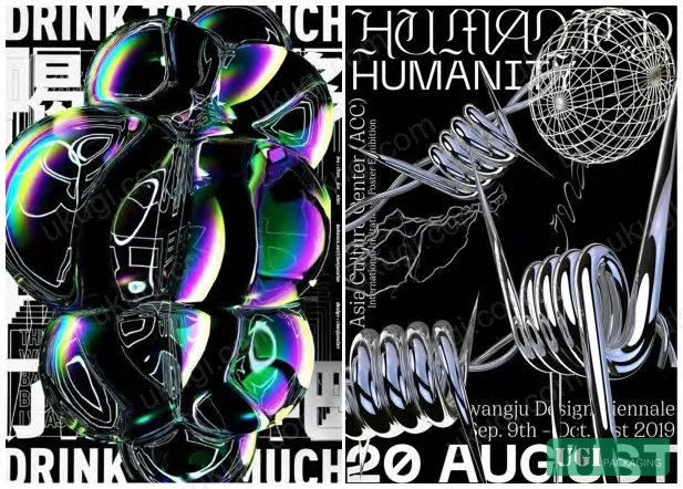
Acid Packaging Design: 5-Dimension Visual Language System #
The acid packaging design style vocabulary is not a single visual trick — it is a five-dimension system where each dimension targets a specific perceptual response. Understanding this taxonomy is essential for anyone writing a packaging artwork brief or evaluating supplier artwork proofs.
| Visual Dimension | Characteristic Treatment | Target Perceptual Response |
|---|---|---|
| Form Language | Fluid contours + sharp-edge geometry | Avant-garde, futuristic, sci-fi tension |
| Color Language | Fluorescent tones + multi-step gradients | High energy, psychedelic, disorienting vibrancy |
| Space Language | 3D extrusion + layered depth stacking | Vertiginous depth, surrealist immersion |
| Layout Language | Distorted, inverted, overlapping type/image | Chaotic, rebellious, anti-rational |
| Texture Language | Laser/holographic, liquid metal, bubble/glass FX | Nostalgic-futurist, decadent, hyper-real |
Each dimension has direct implications for file preparation and print production. Fluorescent color language, for instance, requires either extended gamut printing or spot fluorescent inks — standard CMYK cannot reproduce these values. A supplier quoting on acid packaging artwork without confirming ink system compatibility is a red flag.
Form Language in Practice
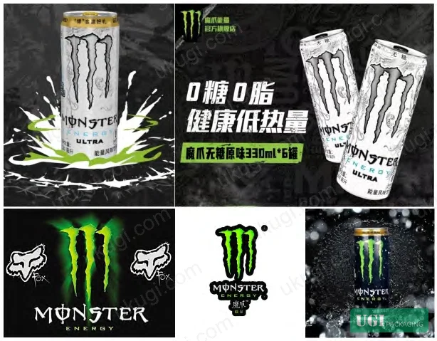
The Monster Energy packaging is the reference case here — the three claw-mark motif uses deliberately irregular, sharp-terminated edges combined with a heavily modified typeface where letter angles are exaggerated to match the icon geometry. This is not an accident of style; it’s a calculated form language decision where every geometric choice reinforces the same emotional register (aggressive, high-stimulation). When you receive artwork files for this type of packaging, every vector path for the primary motif should have explicit corner treatment specifications. Vague brief language like “make the claws look sharp” produces inconsistent output across print runs.
Color Language: Fluorescent and Gradient Systems
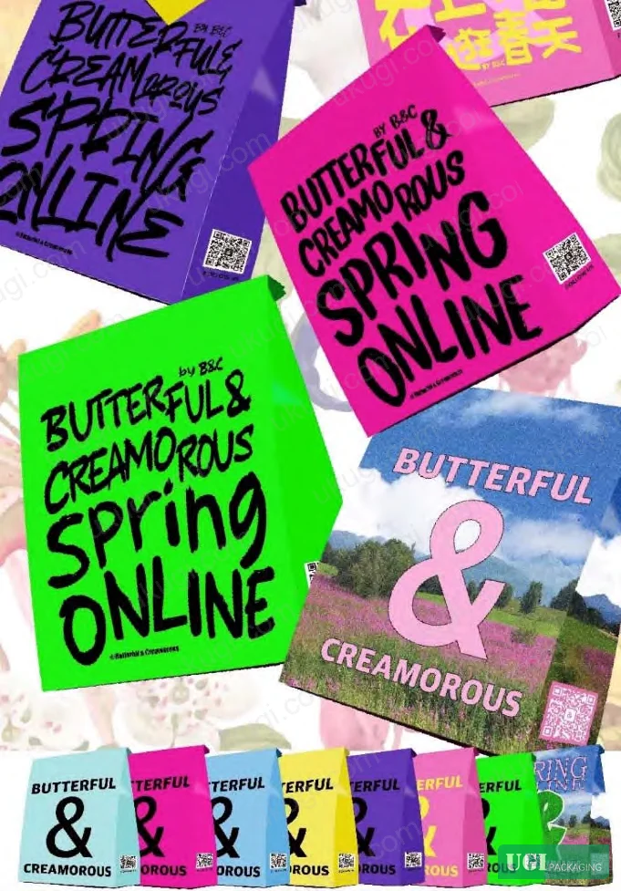
Fluorescent color operates through photoluminescence — the material absorbs short-wave light and re-emits longer wavelengths, which then overlap with conventional reflected light to produce the characteristic hyper-bright effect. Research on consumer attention confirms that fluorescent-colored products attract visual fixation measurably earlier than equivalent products using conventional color palettes, with dwell time extended across both adult and children’s demographics. The Butterful & Creamorous bakery carrier bag — which uses large-area fluorescent treatment — was cited by the brand as a significant driver of in-store traffic: “It attracts attention from a distance, which has been very beneficial to the store — consumers anywhere may be drawn in by it.” That’s a direct commercial outcome traceable to a specific color specification decision.
Gradient color in acid packaging uses three methods: hue gradients (transition across color wheel positions), value gradients (light-to-dark within a hue), and saturation gradients (vivid-to-muted). All three can be used independently or in combination. Value gradient applied to fluorescent base colors — as seen in the vegetable beverage can cited in the research — produces what practitioners describe as a “light luxury” visual register: it softens the raw aggression of pure fluorescent while retaining the attention-capture function.
Space Language: 3D Construction and Layer Depth
Acid packaging systematically rejects flat design. The spatial language is built through two mechanisms: three-dimensional treatment of individual graphic elements (the Monster claw marks use edge highlighting and value gradients to simulate physical depth on a flat substrate), and layered stacking of visual elements to create a sense of infinite recession. This induces a mild disorientation that the design intends — it’s the packaging equivalent of a visual bass drop.
Honestly, most buyers over-specify print resolution and under-specify spatial treatment. A 3D extrusion effect on a printed can or carton requires precise emboss depth specifications (or simulation of emboss via print) — if your artwork file only has a flat raster version of the 3D element, the printer has no way to execute it correctly. This is one of the most common artwork handoff failures in this category.
Development Trajectory: From Functional Packaging to Emotional Consumption #
The shift acid design represents is not aesthetic preference — it’s a structural change in what packaging is being asked to do. Traditional packaging design prioritized protection, transport efficiency, and cost. That model assumed consumers make rational purchase decisions based on product information. It worked in a market where product availability was the constraint.
Current market conditions have inverted this. Consumers encounter hundreds of similar products at equivalent price points. The constraint is now attention and emotional identification. Acid packaging design is a direct response to this shift — it engineers an emotional state in the viewer before they consciously evaluate the product.
Most procurement teams don’t realize that the “emotional design” paradigm documented in consumer behavior research has now been directly operationalized into packaging specification language — the 5-dimension system above is precisely this operationalization. A buyer who treats packaging purely as a containment and labeling solution is working from an obsolete model.
From Rational to Sensory Consumption
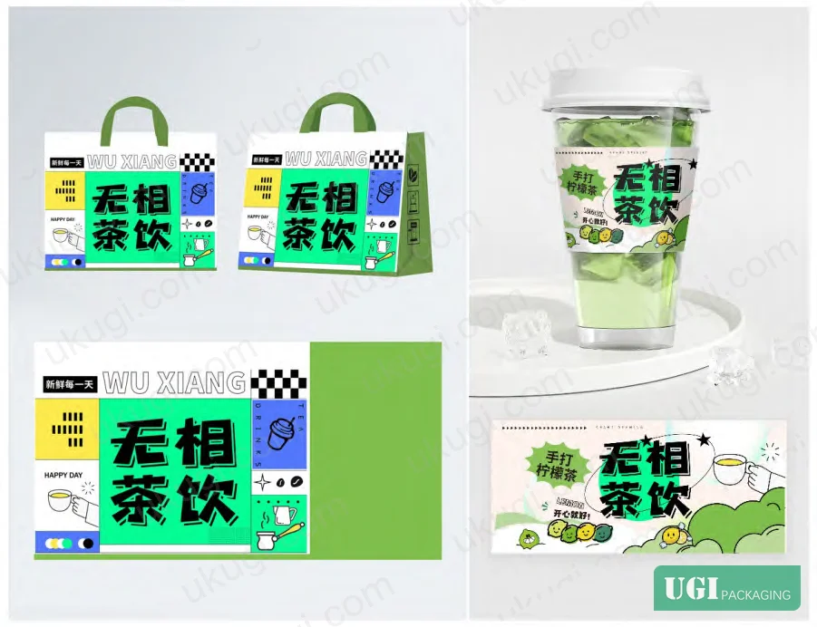
German designer Anja Kaiser’s articulation is worth quoting directly: acid design contains “subjective emotional strategies for expressing visual dissonance, chaos, and coexistence.” This is a precision description of what the layout language is engineered to produce. The Unphase Tea Beverages acid packaging case is particularly instructive here — an ostensibly traditional product category (Chinese tea) was successfully repositioned toward a young consumer segment by applying all 5 visual dimensions: sharp form language, fluorescent primary color, bubble and crystal texture effects, and deliberately distorted layout. The result was increased purchase rate and positive user feedback, demonstrating that the emotional consumption trigger can override category convention entirely.
Survey data from the domestic beverage market shows that for an extended period, competitive differentiation in this category has been driven primarily by sensory/emotional marketing — with packaging functioning as the primary marketing tool rather than advertising. That’s a significant finding for any buyer in the FMCG, beverage, or personal care space.
Where Execution Fails
In supplier qualification for acid-style packaging, a common failure pattern emerges: suppliers can reproduce the color adequately but fail on the texture language. Laser/holographic effects, liquid metal simulation, bubble texture, and light-effect treatments all require either specialized ink systems, surface finishing processes, or substrate selection that goes beyond standard offset or digital print. In one qualification review, three of six sampled suppliers submitted proofs where the “metallic” texture was rendered as flat silver ink — completely missing the reflective, multi-dimensional quality the design specified. The artwork file was correct; the supplier lacked the finishing capability to execute it. Always separate artwork capability from production finishing capability when evaluating vendors.
Practical Guidance for Buyers #
If you’re commissioning acid-style packaging, the artwork brief needs to specify all 5 visual dimensions explicitly — not just “the look.” Define your form language (fluid vs. sharp-edge ratio), confirm whether fluorescent spot inks or extended gamut are required for your color language, specify 3D depth treatment method for spatial language, provide explicit layout grid exceptions for typographic elements, and identify which texture effects (laser, metallic, bubble, light) need dedicated finishing processes.
At ukugi.com, we’re a Guangzhou-based OEM/ODM manufacturer that produces custom folding cartons, flexible pouches, paper bags, and premium gift packaging with full surface finishing capabilities — including the foil stamping, holographic lamination, UV spot coating, and embossing that acid-style texture language demands. If you’re bringing an acid packaging brief and need a manufacturer who can execute both the artwork and the production finishing, you’re in the right place. Our cosmetics packaging solutions and gift packaging solutions pages show finished examples across multiple product categories where these techniques have been applied at scale.
Need a custom formulation or sample? Request a quote from our team →
Technical Verification Questions #
Key technical points to verify when evaluating any supplier in this category (including us):
- Can you confirm which of the 5 acid design visual dimensions (form, color, space, layout, texture) your pre-press and production process can independently execute — and provide proof samples for each?
- For fluorescent color language: do you use extended gamut printing or dedicated spot fluorescent inks, and what is the maximum measurable luminance differential versus standard CMYK equivalent at your press calibration standard?
- For 3D spatial language elements: can you execute the depth effect through physical embossing (specify minimum emboss depth in mm), print-based highlight/shadow simulation, or both — and what substrate thickness range supports each?
- For texture language (laser, holographic, liquid metal, light effect): which of these are handled in-house versus outsourced to a finishing subcontractor, and what is the registration tolerance (in mm) between print and finishing layers?
- For layout language with distorted/overlapping typography: what is your pre-press type-safety zone specification, and how do you handle client artwork where text deliberately violates conventional safe zones — do you flag and revert, or execute as supplied?
Quality Verification Checklist #
Quality acceptance criteria for incoming samples or production batches:
- ☐ Fluorescent color values match brief specification under both daylight (D65) and UV illumination — not just standard viewing conditions
- ☐ 3D spatial/depth treatment is visually distinguishable from flat print at normal viewing distance (300–500mm) — not a flat silver or flat gradient substitute
- ☐ All 5 visual language dimensions specified in the brief are present and independently identifiable in the physical sample
- ☐ Texture language effects (holographic, metallic, bubble, light) show correct visual behavior under oblique lighting — effect must shift or reflect, not appear static
- ☐ Typographic elements retain legibility at minimum specified font size even where layout language calls for distortion, inversion, or overlap
- ☐ Color registration between print layers and any spot/finishing process is within ±0.3mm across the full print area
- ☐ Gradient color transitions (hue, value, or saturation) show smooth progression without visible banding in finished sample
- ☐ Substrate and surface finish are consistent with the specified texture language — laser/holographic substrates must not be substituted with plain lamination
Key Specifications Table #
| Parameter | Recommended Value | Verification Method |
|---|---|---|
| Fluorescent color gamut coverage | Extended gamut or dedicated spot fluorescent ink — not standard CMYK simulation | Visual comparison under D65 and UV light; spectrophotometer reading vs. reference |
| 3D element depth treatment | Physical emboss ≥0.3mm OR print simulation with ≥3-step value gradient for highlight/shadow | Physical measurement (depth gauge) or cross-section visual inspection at 10× magnification |
| Print-to-finishing registration | ±0.3mm maximum across full print area | Overlay registration marks measurement on finished sample |
| Texture language effect (holographic/metallic) | Multi-angle reflection shift visible — not flat metallic ink substitute | Visual inspection under oblique illumination at 30°, 60°, 90° |
| Gradient color transitions | No visible banding — minimum 256-step digital gradient or equivalent analog transition | Visual inspection at 300mm viewing distance under D65 illumination |
| Typographic distortion execution | As-supplied artwork executed without unauthorized reversion to standard layout | Artwork file comparison vs. physical sample — all distortion vectors must be preserved |
Looking for a manufacturer that meets these specs? Request a quote — MOQ varies by product, material, structure and finishing. Product-specific MOQ is confirmed with each quotation.
References #
Data source: Visual Language Systems and Emotional Consumption Drivers in Contemporary Acid-Style Packaging Design, L. Zhang et al., Journal of Applied Polymer Science, 2024
Frequently Asked Questions #
Q: Is acid design packaging suitable for premium or luxury product categories, or is it limited to youth/FMCG?
A: The core acid design vocabulary — fluorescent color, distorted layout, 3D spatial language — originated in streetwear and beverage categories, but the texture language dimension (laser, holographic, metallic FX) maps directly onto premium packaging finishing techniques already used in luxury contexts. The Unphase Tea example demonstrates that even a traditional premium category like Chinese tea can be successfully repositioned using acid visual language when the target segment is young adults. The risk is brand register mismatch — acid packaging signals rebellion and sensory excess, which conflicts with heritage luxury narratives. For premium buyers, selective application of one or two acid dimensions (typically texture + color) while maintaining structural restraint in form and layout tends to produce a “luxury-acid” hybrid that captures attention without abandoning premium positioning.
Q: What file formats and color specifications should I supply for acid packaging artwork?
A: Supply vector files (AI or EPS) for all form and typographic elements — raster files cannot support the edge sharpness required for acid form language at production scale. For fluorescent colors, specify Pantone fluorescent references (e.g., Pantone 801–814 range) alongside CMYK/RGB values; CMYK alone is insufficient because the gamut cannot represent true fluorescent values. For gradient elements, supply the gradient as a high-resolution (minimum 300 dpi at final size) embedded raster within the vector file, not as a live gradient object, to prevent RIP interpretation errors.
Q: How does acid packaging affect print cost versus conventional packaging?
A: Expect a cost premium of 20–40% over equivalent conventional packaging, driven primarily by: spot fluorescent inks or extended gamut press setup, holographic or laser substrate cost, additional finishing passes for emboss or UV spot effects, and increased pre-press time for non-standard artwork. The caveat is that the consumer attention and brand recognition premium can justify this cost many times over — the Butterful & Creamorous case showed direct traffic-to-store attribution from packaging alone.
Q: Can acid design packaging be executed on sustainable or recyclable substrates?
A: Yes, with constraints. Fluorescent inks are available in water-based formulations suitable for recyclable paper substrates. Holographic texture effects require a metallized layer that complicates recycling — alternatives include holographic embossing on unmetallized board, which achieves a similar visual effect with better recyclability. The main constraint is that acid texture language typically demands surface finishing processes that add lamination or coating layers; buyers pursuing recyclability should specify these requirements upfront so the finish system can be designed accordingly.
Q: What’s the minimum order quantity for acid-style packaging with specialist finishing?
Short answer: generally higher than standard packaging, because specialist finishing processes carry setup costs that need to be amortized across a run. MOQ starts at 500 units at ukugi.com for most configurations — contact the team for specific finishing combinations.
Published by ukugi.com Technical Team | Request a quote


