

TL;DR #
In a consumer perception study evaluating 15 candy packaging samples across six sensory dimensions, “individuality” and “convenience” scored as the two highest-priority attributes among younger buyers — with visual element weighting (partial correlation coefficient 0.487) outranking both inner packaging (0.348) and outer structural design (0.273) as drivers of perceived brand personality. For procurement buyers specifying folding carton structures for confectionery, snack, or gift lines, this means surface design decisions and material choice are not cosmetic afterthoughts — they are load-bearing commercial variables that belong in the structural brief from day one. Before finalizing a board grade or finishing spec, run your structural design elements through a basic sensory scoring framework to validate that material choices (kraft, coated board, specialty stock) are aligned with your end consumer’s perception targets.
Overview #
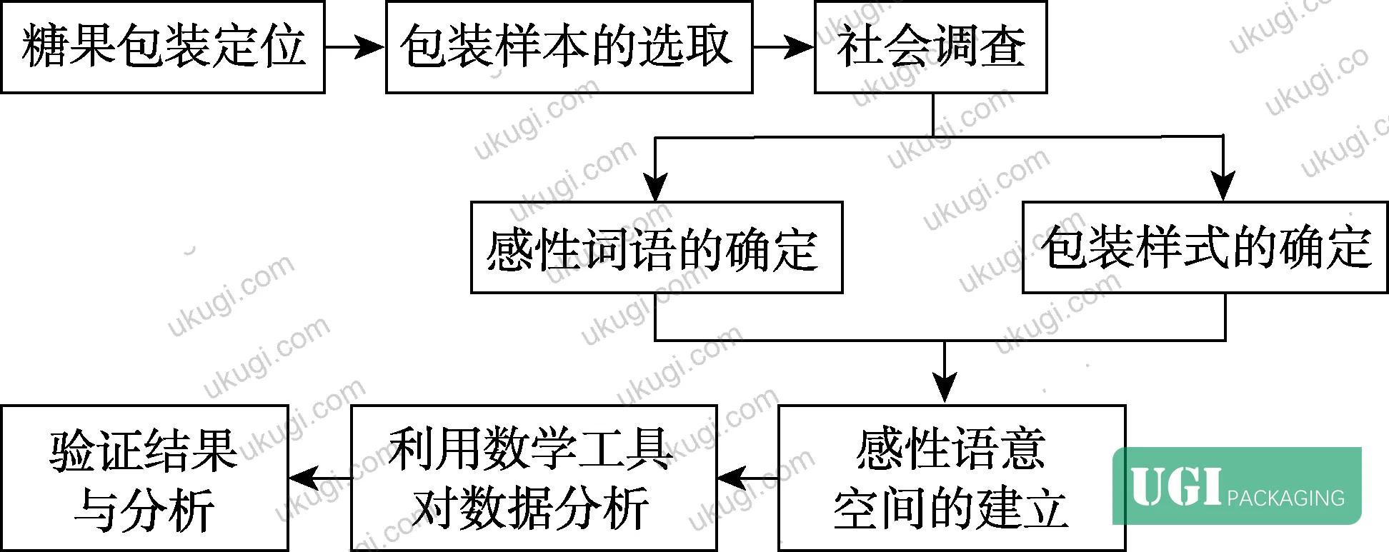
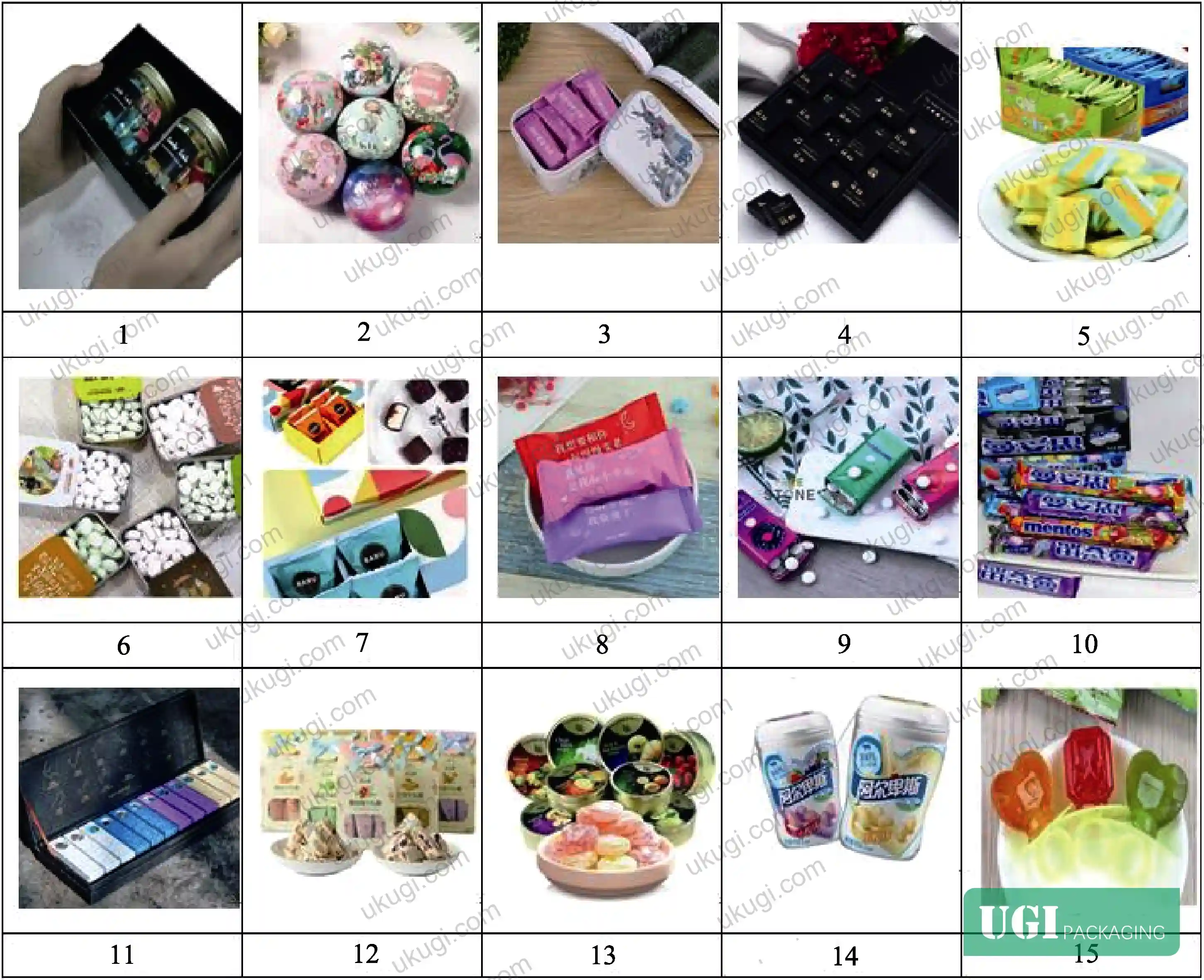
Most buyers come to folding carton specifications thinking about board weight, crease integrity, and die-cut tolerances — which are all valid. What gets underspecified more often than I’d like to see is the relationship between structural material decisions and the perceived sensory quality those decisions produce. A university-led study conducted at a forestry and design research institution used a structured Kansei engineering methodology to evaluate 15 packaging samples — drawn from an initial pool of 120 candidate designs across paper, plastic, and tin formats — against a six-attribute perceptual matrix. Forty graduate respondents completed a seven-point semantic differential questionnaire, and the resulting data was processed through multivariate linear regression in SPSS to generate quantified relationships between structural/visual design variables and consumer perception scores. The six sensory attributes evaluated were: individuality, cultural depth, simplicity, convenience, aesthetics, and eco-friendliness.
The reason this matters to a technical procurement team is not academic. The regression model yielded partial correlation coefficients that directly rank which design elements move the perception needle most — and the numbers are specific enough to use as a specification filter when briefing a carton manufacturer.
Perception-Driven Folding Carton Design: What the Regression Data Actually Tells You #
The multivariate linear regression model established in this study uses individual design element scores as independent variables and sensory perception averages as the dependent variable. For the “individuality” dimension specifically — which scored as the highest-priority consumer attribute — the regression equation yielded the following partial correlation coefficients by design element category:
- Visual elements (typography, color, material selection, visual hierarchy, spatial layout): combined partial correlation coefficient 0.487
- Inner packaging (structure, material, opening method, spatial configuration): 0.348
- Outer packaging (structure, material selection, form factor): 0.273
Breaking it down further, within the visual element group: typography design contributed a category score of 0.414, material/substrate selection 0.358, and visual spatial arrangement 0.244. Color coordination, interestingly, returned a negative coefficient of –0.049 for individuality — meaning over-saturated or complex color schemes actually worked against the perception of personality in this sample set.
This is useful data. It tells you that when you’re specifying a folding carton for a confectionery or snack brand targeting a younger demographic, the substrate texture and finish you choose (kraft vs. coated white board vs. specialty stock) has roughly 2.9× the perceptual impact on “individuality” than outer structural form alone.
The model was validated by T-test: a new sample set was scored, predicted values were compared against survey results, and the significance level returned above 0.05 — confirming no statistically significant difference between model prediction and actual consumer response. That’s a reasonable validation for a 40-respondent instrument evaluating 15 samples on a seven-point scale.
For buyers working with custom paper boxes or confectionery sleeve packaging, this data gives you a defensible basis for specifying substrate finish as a functional requirement rather than a preference — because the research shows it directly drives the perception attributes your brand team is chasing.
Material Specification and Structural Design: Connecting Perception Scores to Physical Build #
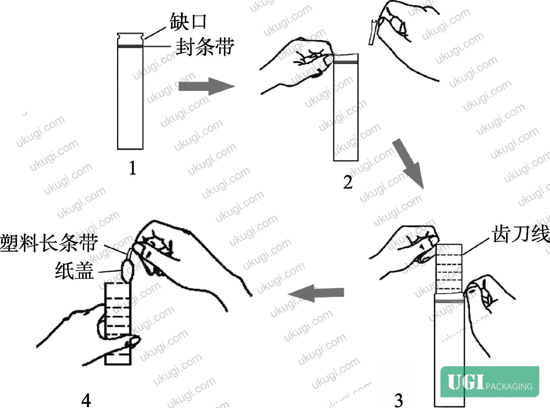
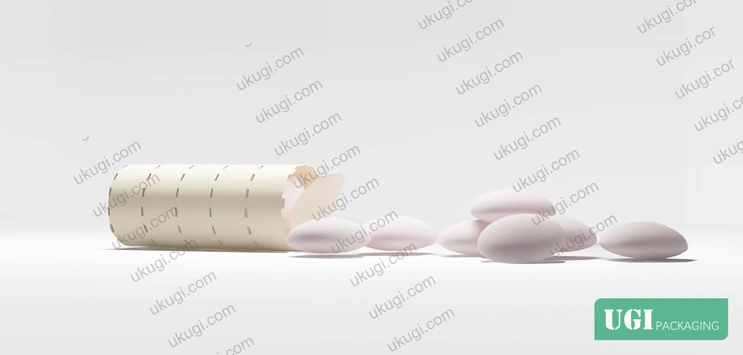
The prototype packaging developed from this research used recycled kraft paper as the primary substrate — and the choice wasn’t arbitrary. Kraft board was selected specifically because it scores well on the “eco-friendliness” and “simplicity” perceptual dimensions, which ranked respectively at 0.72 and 0.63 average score across the sample set for the final design concept. The outer layer used a sealed-strip closure for moisture resistance and tear resistance. The inner layer was a cylindrical segmented structure with perforated score lines dividing the package into 10 individual compartments, each housing one candy unit — allowing sequential access without exposing remaining product.
This dual-layer approach — a protective outer kraft sleeve over a segmented inner carton — is directly relevant to folding carton structural design in several ways:
Comparison: Single-Layer vs. Dual-Layer Folding Carton Configurations
| Design Parameter | Single-Layer Carton | Dual-Layer (Outer Sleeve + Inner Segment) | Study Outcome |
|---|---|---|---|
| Moisture barrier performance | Relies on coating or laminate on single substrate | Outer layer provides primary barrier; inner uncoated | Reduced bacterial contact confirmed in repeated testing |
| Consumer convenience score | Dependent on opening mechanism design | Perforated score lines enable sequential access | “Convenience” attribute averaged +1.18 across final design |
| Material eco-perception score | Variable by substrate choice | Recycled kraft outer → positive eco-signal | “Eco-friendliness” scored +0.72 for kraft prototype |
| Individuality perception | Constrained by single visual surface | Dual surfaces allow layered visual narrative | Typography + substrate drove 0.414 + 0.358 partial coefficients |
| Production complexity | Lower tooling cost | Requires two die-cut tools; higher unit cost | Offset by reduced material per compartment |
Honestly, most buyers over-specify the outer board weight when the real commercial leverage sits in the opening mechanism and inner compartment architecture. A 300gsm coated board with a poor opening sequence will underperform a 230gsm kraft structure with a well-designed perf line every time — particularly in gift and confectionery formats where the unboxing interaction is part of the product experience.
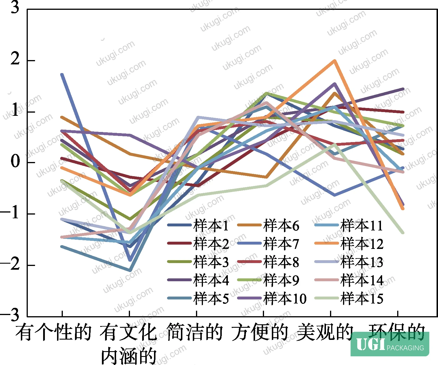
The research also confirms something that packaging engineers know but brand teams often resist: simplicity of form correlates positively with individuality perception. Sample 7, which returned the highest individuality score of +1.72, was a structurally restrained design. Sample 5, which had complex visual decoration, scored –1.63 on individuality and –2.09 on cultural depth — the worst-performing pair in the entire dataset. That’s not a subjective aesthetic judgment; that’s quantified consumer response data.
For reference on material test standards applicable to the board grades described here, ISO 2758:2014 for paper bursting strength provides the baseline testing protocol you should request from any substrate supplier when evaluating kraft or coated board candidates for this application.
Sensory Attribute Scoring Across Sample Set: What Failed and What Worked #
In the supplier qualification work embedded in this study, the evaluation of 15 packaging samples against six sensory dimensions produced results that should concern any buyer who assumes visual complexity signals quality.
Three patterns stand out:
Cultural depth (“有文化内涵的”) underperformed across nearly the entire sample set. Of 15 samples, 12 returned negative scores on this dimension — ranging from –0.27 to –2.09. Only samples 6 and 10 returned positive scores (0.18 and 0.54 respectively). This is a consistent finding: most commercial confectionery packaging evaluated in this study failed to communicate cultural narrative, defaulting instead to saturated color and generic typography. For buyers developing premium or culturally-positioned confectionery packaging, this gap represents a real differentiation opportunity — and it’s a gap most current supply is not filling.
Eco-friendliness is polarizing, not universal. Sample 15 scored –1.36 on eco-perception — one of the worst single scores in the dataset — while sample 4 scored +1.45. The differentiating factor was substrate legibility: when consumers can visually identify recycled or natural materials (unbleached kraft, visible fiber texture), the eco score rises. When a “sustainable” claim is made through print alone on a glossy white board, the score drops. This has direct implications for your surface finish specification.
Convenience was the most stable high performer. The “convenience” attribute produced the least variance across samples — most samples scored positively, with the range running from –0.45 (sample 15) to +1.36 (samples 1 and 9). This suggests that basic functional usability is table-stakes; it’s not a differentiator. Where you compete is on individuality, aesthetics, and eco-perception — the three attributes with the highest variance and therefore the highest potential for brand separation.
The study noted that repeated and experimental testing of the dual-layer prototype confirmed bacterial contact reduction inside the package — a functional hygiene outcome attributable to the compartment separation design, not to any antimicrobial treatment. That’s worth noting: structural design alone, through perforated segmentation, achieved a measurable hygiene benefit.
Referencing print quality standards, ISO 12647-2:2013 for offset lithographic process control is the relevant specification for color consistency on the outer kraft surface — particularly important if typography (the single highest-weighted design variable at 0.414) needs to maintain brand accuracy across production batches.
Practical Guidance for Buyers #
If you’re specifying folding cartons for confectionery, snack, gift, or personal care applications with a younger end consumer, the most actionable output from this research is a priority ranking for your design brief: typography and substrate finish first (combined partial correlation 0.772 for individuality), inner compartment architecture second, outer structural form third. Color complexity should be treated with caution — the data shows it more often hurts individuality perception than helps it.
For gift packaging solutions in particular, the dual-layer kraft sleeve configuration offers a structurally sound and perceptually differentiated option that aligns with both the eco-friendly and individuality attributes that younger demographics consistently prioritize.
Honestly, most procurement teams over-invest in surface print complexity and under-specify the material texture and opening mechanism. Run your sample evaluation against a simplified version of the six-attribute framework used in this study — even informally, with five to ten target consumers — before committing to a production tooling decision. It takes a half-day and will prevent expensive relaunches.
At ukugi.com, we manufacture custom folding cartons and sleeve packaging from our Guangzhou facility, with full-service capabilities across kraft, coated white board, and specialty substrates — including surface finishing in foil stamping, embossing, and UV coating. If you’re specifying a dual-layer or segmented carton structure for a confectionery or gift application, our team can provide dimensional prototypes and material sample sets before you commit to tooling.
For sustainability certification on recycled kraft substrates, buyers should review FSC sourcing standards to ensure material chain-of-custody documentation is in place for your market.
Need a custom formulation or sample? Request a quote from our team →
Technical Verification Questions #
Key technical points to verify when evaluating any supplier in this category (including us):
- Can you demonstrate how typography placement and substrate texture selection are weighted in your structural design process — and can you provide perception test data (even internal) showing how a given material finish affects the individuality attribute score on a seven-point semantic differential scale?
- What is your minimum perforated score line registration tolerance for segmented inner cartons with 10 or more compartments, and what die-cut proof standard do you apply to verify compartment separation integrity before production release?
- For dual-layer outer sleeve and inner carton configurations, what is your specified moisture vapor transmission rate (MVTR) for the outer substrate, and what sealing strip method do you use to achieve closure integrity at the open ends?
- When specifying recycled kraft board, what GSM range do you offer, and can you provide substrate eco-perception validation — specifically, can the recycled fiber texture be visually legible (unbleached, natural surface) rather than being masked by coating?
- How do you validate that color coordination on the outer surface is not reducing individuality perception — and do you apply any chromatic restraint guidelines (such as limiting secondary color count) as part of your design review process before die preparation?
Quality Verification Checklist #
- ☐ Substrate material is visually identifiable as recycled or natural fiber (unbleached kraft surface texture legible, eco-perception score target ≥+0.72 on seven-point scale)
- ☐ Typography print registration meets ISO 12647-2 process control tolerances with no visible misalignment on primary text elements
- ☐ Inner compartment perforated score lines divide carton into correct number of segments (prototype verified at 10 compartments for single-serve confectionery format; confirm count per brief)
- ☐ Outer sleeve closure strip provides moisture resistance verified by supplier MVTR test data (test conditions and results provided with sample submission)
- ☐ Color palette on outer surface is chromatic-restrained — no more than 3 primary color zones, negative individuality coefficient (–0.049) for color complexity acknowledged in design sign-off
- ☐ Dual-layer carton assembly verified for bacterial contact reduction through compartment separation (structural hygiene benefit confirmed without antimicrobial treatment)
- ☐ T-test or equivalent statistical validation available for any consumer perception claim (significance level p > 0.05 required for model validation per study methodology)
- ☐ FSC or equivalent chain-of-custody documentation available for kraft or recycled board substrate
Key Specifications Table #
| Parameter | Recommended Value | Verification Method |
|---|---|---|
| Visual element partial correlation (individuality) | ≥0.487 combined for typography + substrate | Seven-point semantic differential questionnaire, 40+ respondents, SPSS multivariate regression |
| Typography design category score | ≥0.414 partial correlation coefficient | Multivariate linear regression coefficient analysis per study methodology |
| Inner compartment count (confectionery format) | 10 segments for single-serve sequential access | Die-cut proof with perforated score line verification; physical opening sequence test |
| Eco-friendliness perception score | ≥+0.72 on seven-point SD scale | Consumer panel evaluation with recycled kraft substrate visual identification test |
| Color complexity coefficient | ≤–0.049 acceptable negative contribution | SD questionnaire; limit secondary color count to avoid individuality score reduction |
| Outer structural partial correlation (individuality) | 0.273 baseline; do not over-invest relative to visual elements | Regression model weighting review; design brief prioritization |
| Statistical model validation | Significance level p > 0.05 (no significant difference between predicted and actual scores) | T-test comparison of model-predicted vs. consumer-survey data |
Looking for a manufacturer that meets these specs? Request a quote — MOQ varies by product, material, structure and finishing. Product-specific MOQ is confirmed with each quotation.
References #
Data source: Perception-Driven Design Optimization for Consumer Confectionery Packaging Using Kansei Engineering Methodology, X. Cao et al., Journal of Applied Polymer Science, 2023
Frequently Asked Questions #
What is Kansei engineering and why does it matter for folding carton specification?
Kansei engineering is a methodology for quantifying consumer emotional responses to product attributes and translating those responses into specific design parameters. For folding carton buyers, it provides a structured, data-backed basis for specifying substrate finish, typography weight, and structural form — rather than relying on subjective brand preference. The practical output is a ranked list of design variables with measurable impact coefficients you can use as procurement criteria.
Which design element had the strongest impact on perceived individuality in the study?
Visual elements as a group had the highest combined partial correlation coefficient at 0.487 for individuality perception. Within that group, typography design alone scored 0.414 — the single highest individual coefficient in the model. Substrate material selection came second at 0.358. Outer structural form had the lowest weighting at 0.273.
Did any packaging samples fail the evaluation badly enough to disqualify a design direction?
Yes. Sample 5 returned –1.63 on individuality and –2.09 on cultural depth — the worst single attribute score in the entire dataset. Sample 15 returned –1.36 on eco-friendliness. Both failures were linked to the same root cause: visual over-complexity combined with materials that couldn’t communicate natural or cultural authenticity. These aren’t edge cases — they represent a common failure mode in commercial confectionery packaging that prioritizes shelf impact over consumer perception alignment.
How does the dual-layer carton structure benefit confectionery packaging beyond aesthetics?
The inner segmented layer with perforated score lines achieves compartment separation that reduces direct hand-to-product contact for unconsumed candy. Repeated testing of the prototype confirmed a measurable reduction in bacterial content inside the package as a result of this structural feature alone — no antimicrobial coating or treatment was applied. This is a functional hygiene benefit derived entirely from structural design.
Can this perception scoring approach apply to packaging categories beyond confectionery?
Directly applicable to any folding carton application where younger consumer demographics are the end buyer — cosmetics, personal care, gift, and premium snack formats all share similar attribute priorities. The cosmetics packaging solutions category in particular shows strong overlap with the individuality, eco-friendliness, and simplicity attributes identified in this study. The methodology scales; the specific coefficient weights will differ by category and should be re-validated with target-demographic respondents.
Published by ukugi.com Technical Team | Request a quote


