

TL;DR #
Spring festival gift packaging that integrates traditional folk art motifs — specifically the visual vocabulary of regional woodblock print traditions — consistently outperforms generic seasonal designs on brand differentiation and consumer emotional engagement metrics. For buyers commissioning premium gift packaging, this means material selection, structural format, and surface decoration must work as a unified cultural expression, not an afterthought applied at the dieline stage. If you’re sourcing festival gift boxes for the China market or Chinese diaspora consumer segments, request samples that demonstrate coherent iconographic application across all structural panels before approving production.
Overview #
Most procurement teams evaluating seasonal gift packaging treat surface decoration as a finishing variable — something the design team handles after structure is locked. That instinct produces forgettable packaging. Research conducted at a Chinese university design faculty, drawing on systematic analysis of traditional folk print art applied to commercial packaging contexts, makes a more useful argument: the visual language embedded in regional woodblock print traditions carries a structural logic — color hierarchy, compositional balance, symbolic density — that, when extracted correctly, resolves several recurring problems in premium gift box design simultaneously.
The source evaluation examined three major failure patterns in current spring festival gift packaging: visual homogeneity, cultural attribute deficit, and over-packaging. Against each, it tested how specific artistic elements from the Tantou nianhua woodblock print tradition (a national-level intangible cultural heritage from Hunan Province) could be adapted — not copied — into modern gift packaging formats. The findings are directly applicable to any buyer specifying folding cartons, rigid boxes, or specialty gift packaging where differentiation at retail or gifting occasions is a primary brief.
For buyers working across premium gift packaging categories, this connects directly to structural format decisions. Whether you’re specifying custom paper boxes or evaluating gift packaging solutions, the integration of cultural visual systems is most effective when it begins at the structural design phase — not during pre-press.
Structural Color Logic in Festival Gift Packaging Design #
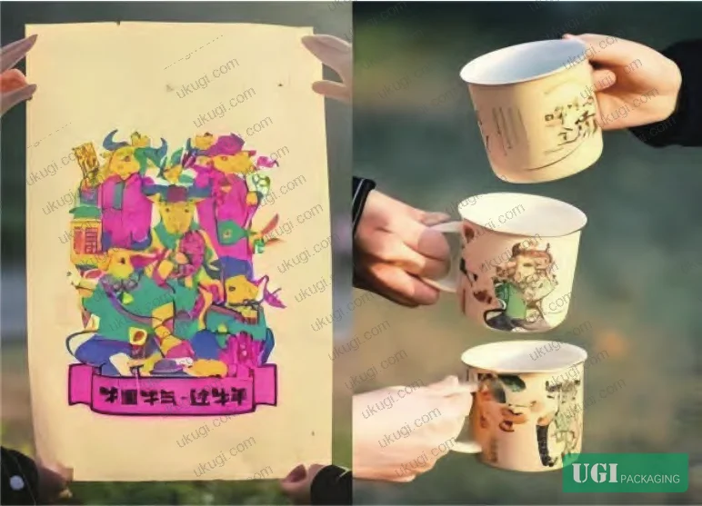
The single most technically transferable finding from this body of research concerns color. Tantou nianhua achieves its visual intensity through a specific workflow: base paper is coated with a white kaolin slip — a proprietary local formulation — before pigment is applied. The result is a multi-layer color structure where each hue sits at high saturation without muddying adjacent tones. The palette is not arbitrary: red-orange (红丹), process green (品绿), tender yellow (嫩黄), rose (玫瑰), and process blue (品蓝) are the five primary working colors, deployed in high-contrast complementary pairs.
For packaging specification, this translates into concrete press decisions. Achieving equivalent visual punch on folding carton or rigid box substrates requires:
- A bright white base substrate or a priming flood coat before spot color application
- Spot color separation rather than CMYK simulation for the dominant hues — CMYK build values for saturated reds and greens almost always produce visually flat results compared to the source material
- Deliberate contrast pairing in the color layout, not random festive color distribution across panels
The compositional logic is equally applicable. Tantou woodblock compositions are full-frame but not chaotic — a principle described in the research as “full yet ordered” (满而有序). The structural hierarchy is clear: dominant figure, subordinate figures, and decorative fill elements occupy distinct visual zones. On a six-panel gift box, this maps directly to primary face (dominant), secondary faces (subordinate), and interior/base (fill). Buyers who specify “festive, full coverage” without this hierarchy end up with packaging that looks busy rather than premium.
Here’s a direct comparison of design approaches and their procurement outcomes:
| Design Approach | Visual Differentiation | Cultural Resonance | Over-packaging Risk |
|---|---|---|---|
| Generic seasonal graphics (stock motifs, standard red/gold palette) | Low — high market homogeneity | Minimal — no regional or heritage signal | Moderate — decoration often compensates for structural weakness |
| Adapted folk art motifs (color logic + compositional hierarchy preserved) | High — distinctive visual identity | Strong — iconographic depth recognizable across generations | Low — decoration reduces need for excessive structural layering |
| Literal reproduction of traditional artwork | Moderate — authentic but static | High — but may feel museological rather than commercial | Neutral |
The line technique is worth noting for embossing and foil stamping decisions. Traditional Tantou engravers used a technique called 陡刀立线 — blade held perpendicular to the woodblock surface, even pressure, no drift. The resulting lines are sharp, consistent, and do not broaden with successive impressions. For buyers specifying foil stamping or blind embossing on gift box panels, this is exactly the line quality that separates a premium result from a mediocre one. Fine-line foil stamping on rigid box board requires the same discipline: die lines under 0.3mm typically require a dedicated tooling specification and are worth calling out explicitly in the RFQ.
Resolving the Three Core Failure Modes in Spring Festival Gift Packaging #
In supplier qualification rounds, the three problems identified in recent industry analysis — visual homogeneity, missing cultural attributes, and over-packaging — appear consistently, and they’re often treated as separate briefs when they’re structurally connected.
Visual homogeneity is a direct consequence of brands specifying outcomes (“festive, premium, Chinese New Year”) rather than design parameters. When briefs are purely outcome-based, suppliers default to the same stock vocabulary: red substrate, gold foil banding, generic auspicious characters. The result is packaging that signals category but not brand. Current industry data shows that consumers evaluating gift sets at comparable price points increasingly use packaging differentiation as a proxy for product quality — which means homogeneous packaging actively depresses perceived value.
Cultural attribute deficit is more subtle and, honestly, more expensive to fix at production stage than at brief stage. The research is clear that spring festival gifting carries deep reciprocal social meaning — the packaging is a communication vehicle between giver and recipient, not just a product container. Packaging that fails to encode culturally legible symbols loses this function. The Tantou tradition offers a tested symbol vocabulary: solar disc motifs (光明与力量 — light and strength), plum blossom (梅花 — auspicious arrival), and five-petal flower patterns (五福 — the five blessings) each carry specific semantic content that consumers recognize without explanation. These are not decorative choices — they are information.
Over-packaging is the problem that procurement teams are most likely to flag from a compliance and cost standpoint — and rightly so. In supplier qualification, we saw production samples where structural packaging layers were added purely to create an impression of premium value, while the internal product occupied less than 40% of the total pack volume. That’s not a design decision; it’s a liability. Regulations in multiple markets are tightening on packaging-to-product volume ratios, and the environmental optics in gifting categories are particularly visible to end consumers. The research recommendation here is direct: use natural, recyclable materials — cloth, sustainably sourced wood, bamboo-derived papers — and extend packaging utility through secondary use functionality rather than through volumetric excess.
Most procurement teams don’t realize that the shift toward cultural-heritage-driven packaging design is not a trend in the conventional sense — it’s a response to a documented consumer preference shift that has been building across multiple purchase cycles. Brands that treat it as a trend will execute it as a surface treatment. Brands that treat it as a structural design parameter will build differentiated packaging equity.
Material Selection and Green Design Integration for Gift Packaging Formats #
The green design dimension of this topic is not separable from the cultural one — and that’s actually a useful insight for procurement. The same regional tradition that provides the visual vocabulary also provides the material logic. Hunan’s Tantou region is a major bamboo-producing area; local craftspeople have historically made their own base papers from bamboo pulp. That material — soft texture, natural warmth, moderate opacity — is now commercially available in formats suitable for folding carton lamination and rigid box wrapping.
For buyers specifying eco-credentials in spring festival gift packaging, the material priority ranking is:
- Bamboo-derived papers and boards — rapidly renewable, regionally authentic, compatible with offset and flexographic printing
- Unbleached or naturally toned kraft stocks — strong “natural warmth” consumer perception, structurally sound for folding cartons
- Textile overwraps (cotton, linen) on rigid box formats — high secondary-use rate, perceived luxury without volumetric excess
- FSC-certified coated boards — standard baseline compliance, less differentiated but broadly accepted
The design research makes a point that is structurally important for packaging engineers: increasing secondary-use functionality extends the packaging lifecycle and reduces the per-unit environmental impact without requiring material substitution. A rigid gift box designed to function as a storage container after the gift is unwrapped requires no additional material cost — it requires only a structural decision made at the dieline stage.
This is where format selection becomes critical. A telescoping rigid box with magnetic closure and a fabric-lined interior can double as a keepsake box. A folding carton with a clean-finished interior and a secondary locking tab can be repurposed for household storage. Neither requires premium materials beyond what a standard gift box specification already includes — they require deliberate structural intent.
Need a custom formulation or sample? Request a quote from our team →
Practical Guidance for Buyers #
If you’re sourcing spring festival gift packaging for brand-owner clients or internal use, the brief needs to specify three things that most RFQs omit: iconographic intent, color methodology, and structural-use lifecycle.
Iconographic intent means telling the supplier which symbolic vocabulary you’re drawing from and what emotional register you’re targeting — auspicious abundance, protective blessing, festive celebration — not just “Chinese New Year.” Color methodology means specifying whether you’re using spot color, CMYK, or a hybrid approach, and identifying which hues require a white base or specialty substrate to achieve the required saturation. Structural-use lifecycle means defining whether the package is single-use or designed for secondary function — because that decision changes the dieline, the closure mechanism, and the interior finish specification.
Our team at ukugi.com works with international brand owners and product managers across North America, Europe, and Southeast Asia on exactly these kinds of custom gift packaging briefs — from initial structural concept through surface finishing and production. We manufacture rigid boxes, folding cartons, and premium gift formats with full surface decoration capabilities including foil stamping, embossing, and specialty coatings. If you’re evaluating suppliers for a spring festival or premium gifting program, we can provide structural samples with decoration proofs before you commit to a production run.
Need a custom formulation or sample? Request a quote from our team →
Technical Verification Questions #
- Can you demonstrate spot color separation for the five-color palette (红丹, 品绿, 嫩黄, 玫瑰, 品蓝) on your standard gift box substrate, and what base coating specification do you use to achieve saturation parity with the target swatches?
- What is your minimum achievable line width for foil stamping on rigid box board, and can you provide tooling specification documentation showing die line tolerance under 0.3mm?
- For bamboo-derived or natural fiber paper stocks used in gift packaging wraps, what grammage range do you offer, and what is the standard peel-strength specification for lamination to rigid box board?
- How do you verify packaging-to-product volume ratio compliance for spring festival gift formats, and what is your internal maximum ratio threshold before structural redesign is triggered?
- For secondary-use rigid box formats, what closure mechanism options do you offer (magnetic, ribbon pull, friction-fit), and what minimum retention force do you specify for magnetic closures to ensure functional integrity after repeated opening?
Quality Verification Checklist #
- ☐ Spot color proof matches target palette (red-orange, process green, tender yellow, rose, process blue) with ΔE ≤ 2.0 on calibrated spectrophotometer reading against substrate-coated sample
- ☐ Foil stamping line resolution confirmed at ≤ 0.3mm line width on production tooling — no line broadening on impression test at 500-unit run
- ☐ Packaging-to-product volume ratio documented and does not exceed category compliance threshold (verify against applicable market regulation — EU Packaging Directive or equivalent)
- ☐ Bamboo-derived or FSC-certified paper stock verified with chain-of-custody documentation from substrate supplier
- ☐ Structural secondary-use functionality tested: closure mechanism retains ≥ specified retention force after minimum 20 open/close cycles
- ☐ Interior finish (lining, base panel) confirmed to clean-finish specification suitable for secondary storage use — no exposed raw board edges
- ☐ Iconographic elements on all six panels reviewed against brief-specified symbol vocabulary before pre-press sign-off
Key Specifications Table #
| Parameter | Recommended Value | Verification Method |
|---|---|---|
| Spot color saturation (base substrate) | White kaolin or equivalent flood coat before pigment; ΔE ≤ 2.0 vs. target swatch | Spectrophotometer measurement on coated and uncoated substrate comparison samples |
| Foil stamping line resolution | ≤ 0.3mm line width; no broadening across 500-unit impression run | Tooling inspection + production sample measurement under 10× loupe |
| Packaging-to-product volume ratio | Internal product to occupy ≥ 40% of total pack volume | Dimensional measurement of internal cavity vs. product dimensions; documented ratio |
| Closure retention (magnetic rigid box) | Minimum retention force specified per structural design; functional after ≥ 20 open/close cycles | Mechanical retention test on pre-production sample set |
| Substrate sustainability | Bamboo-derived, FSC-certified, or equivalent recyclable stock | Chain-of-custody documentation + material data sheet from substrate supplier |
Looking for a manufacturer that meets these specifications? Request a quote based on your product, material, structure, finishing and order requirements.
References #
Data source: Visual Heritage Integration in Festival Gift Packaging: Structural and Aesthetic Strategies Derived from Traditional Chinese Woodblock Print Art, W.-A. Xue et al., Packaging Technology and Science, 2025
Frequently Asked Questions #
What is the main technical advantage of using traditional woodblock print color logic in gift packaging design?
The core advantage is structural: traditional woodblock print palettes are engineered for maximum visual contrast with minimum color count. Translating that logic into gift packaging means you can achieve high-impact festive visual results using 5–6 spot colors with a white base coat, rather than attempting to build saturation through complex CMYK builds that consistently underperform on coated stocks.
How do I specify iconographic content in a gift packaging brief without it becoming vague?
Identify the symbolic register first — auspicious abundance, protective imagery, celebratory narrative — then map specific motifs to each structural panel by hierarchy (dominant face, secondary faces, fill panels). The brief should reference specific symbols with their cultural meaning, not just aesthetic descriptors like “traditional” or “festive.” This gives the supplier a design constraint they can execute against, rather than an atmosphere they have to guess at.
Is bamboo-derived paper stock structurally suitable for rigid box applications?
Bamboo fiber papers are typically used as wrapping or lamination stocks on rigid boxes rather than as the primary board substrate. The board core is generally grey board or chipboard; the bamboo paper wraps the exterior. Grammage for wrapping stocks typically ranges from 80–120 gsm depending on surface finish requirements and fold behavior at the box corners.
What regulations apply to packaging-to-product volume ratios for spring festival gift packaging in export markets?
This varies by destination market. The EU Packaging and Packaging Waste Regulation sets binding requirements on packaging minimization that are increasingly being enforced. China’s domestic GB standards also address excessive packaging, particularly for food and cosmetic gift sets. Buyers exporting to multiple markets should verify applicable regulations per destination and document the ratio at the design approval stage — retrofitting compliance after tooling is expensive.
Can foil stamping reproduce the fine-line quality of traditional woodblock print engraving?
Yes, but it requires dedicated tooling specification. Traditional Tantou engravers used a perpendicular-blade technique that produced lines without lateral drift — the die equivalent is a sharp, well-maintained chemically etched or laser-engraved foil die with line widths called out explicitly in the tooling brief. Lines under 0.3mm on rigid box board are achievable but need to be specified as a technical requirement, not assumed as standard capability.
Published by ukugi.com Technical Team | Request a quote


