

TL;DR #
Consumer surveys cited in cross-cultural packaging research show that approximately 80% of Korean respondents perceived Chinese-character branding as more elegant than pure Hangul alternatives — a statistically significant preference gap that directly affects premium pricing power in East Asian markets. For international brand owners and packaging buyers, this means script selection and typographic execution are not aesthetic afterthoughts; they are measurable commercial levers that require the same rigor as structural or material specifications. Before committing to a packaging design that incorporates culturally loaded script elements, commission a structured consumer perception audit covering at least 3 distinct regional dialect groups and validate all character choices with native-language specialists.
Overview #
If you are sourcing cosmetics packaging for East Asian markets — or designing premium gift packaging with cross-cultural appeal — script and typographic strategy deserves the same specification discipline you apply to board weight or surface finish. Research conducted within a visual information design institution examining multiple flagship Korean cosmetic brands reveals a consistent pattern: the deliberate use of Chinese characters (Hànzì) in packaging functions not as decoration but as a precision brand-positioning instrument, one with measurable consumer response data attached to it.
The study analyzed three major brand cases in depth — each representing a distinct strategic approach to Chinese character integration — alongside broader market survey data from Korean consumer forums. The findings have direct implications for any packaging buyer specifying premium cosmetics, gift, or wellness product packaging destined for Chinese-speaking or East Asian markets.
For context on surface finishing decisions that support this kind of premium typographic execution, ISO 14021:2016 Environmental labels and declarations — Self-declared environmental claims provides useful grounding on how labeling claims must be substantiated when premium materials or cultural narratives underpin marketing communication.
Chinese Character Application in Premium Cosmetics Packaging: Three Case Studies #
The three brands examined — Sulwhasoo (雪花秀), The History of Whoo (后), and Ryo (吕) — each deployed Chinese characters with a different strategic intent, and each achieved a distinct brand equity outcome. What is instructive for packaging engineers is that the character choices were not arbitrary; each was selected for a precise combination of semantic content, visual form, and cultural memory activation.
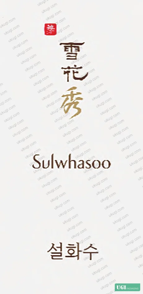
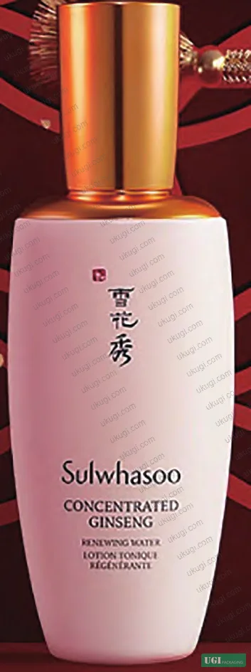
Sulwhasoo (雪花秀)
The brand name uses three characters: 雪 (snow), 花 (flower), and 秀 (elegance/excellence). The packaging deploys these on a white ground with mixed calligraphic scripts — 雪花 written in Lishu (clerical script), 秀 in Kaishu (standard script). This is not random font mixing. Lishu is compact and horizontally structured, projecting formality and historical weight. Kaishu is more fluid and alive. The combination produces a visual rhythm that reads as simultaneously authoritative and organic — which mirrors the brand’s core positioning around natural herbal skincare with heritage credentials.
The semantic layering is deliberate: classical Chinese poetry (notably Bai Juyi’s Song of Everlasting Regret) uses 雪 and 花 together as metaphors for feminine beauty and purity of complexion. A Chinese-literate consumer reads the brand name and activates centuries of aesthetic association. A Korean consumer reads it as prestigious cultural capital. A Western consumer reads it as exotic and refined. One packaging execution, three distinct market responses — all from three characters.
The History of Whoo (后)
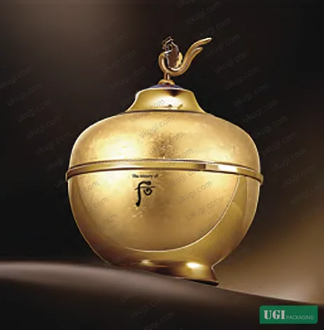
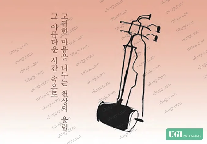
This brand uses a single character — 后 (empress/queen) — and pushes its visual execution to an extreme. The character is redesigned as a Xi Qin (奚琴), a traditional string instrument with Chinese origins that became part of Korean court music. The packaging body is imperial yellow (the exclusive color of Chinese royalty), the cap is modeled on phoenix motifs (凤纹), and the base is structured as a three-tier pedestal echoing classical Chinese ceremonial architecture.
The character 后 is deliberately ambiguous: it can mean “behind/after” or “empress/queen” depending on context. The brand exploits this semantic duality. For East Asian consumers, the imperial connotation is immediately activated. For Western consumers, the calligraphic gold letterform reads as mysteriously Eastern and luxurious. Consumer research cited in the study found this dual-market legibility was a calculated outcome, not a coincidence.
Ryo (吕)
The Ryo brand uses a character from ancient Chinese musical theory — 吕 is one of the twelve tonal pitches in the classical Chinese tonal system (律吕), specifically the yin (feminine/soft) pitches that balance the yang (masculine/strong) 律 pitches. The philosophy of harmonic balance embedded in this character maps directly to the brand’s product positioning: scalp health as a foundation for healthy hair, balance as the mechanism of efficacy.
The character itself — two stacked rectangular 口 forms — has a visual symmetry and simplicity that works exceptionally well in small-format packaging applications. Written in Emperor Huizong’s Slender Gold (瘦金体) calligraphic style, it projects refinement without complexity. The brand extended this logic into a collaboration with the National Gugak Center, incorporating 編鐘 (Chinese chime bells) forms into bottle design — and the resulting limited edition sold out, providing real market validation of the cultural-premium pricing mechanism.
| Brand | Character Used | Strategic Intent | Visual Execution | Market Response |
|---|---|---|---|---|
| Sulwhasoo (雪花秀) | 雪花秀 (Snow, Flower, Elegance) | Natural purity + feminine beauty + excellence | Mixed Lishu/Kaishu calligraphy on white ground | Positioned as Korea’s “national prestige brand,” gifted at G20 |
| The History of Whoo (后) | 后 (Empress/Queen) | Imperial luxury + court heritage | Gold ink calligraphy, yellow body, phoenix motifs, three-tier base | Named “Brand Most Loved by Chinese Consumers” |
| Ryo (吕) | 吕 (Yin tonal pitch — harmony/balance) | Scalp health through harmonic balance philosophy | Slender Gold script; color-coded series (black/red/green/purple) | ~80% of surveyed Korean consumers preferred Hànzì logo over Hangul |
The Structural Logic of Script-Based Brand Positioning #
Understanding why Chinese characters work as premium packaging signals requires understanding their structural properties as a writing system — and this is where most packaging briefs go wrong.
Honestly, most buyers treat script selection as a font choice. It is not. Chinese characters are logographic: each unit carries semantic content independent of phonetic pronunciation. The character 雪 does not just sound like “snow” — it visually encodes snow through its radical composition (雨 rain above 彡 crystalline form). A reader with any exposure to the character retrieves a semantic constellation, not just a sound. This is fundamentally different from Latin, Arabic, or Devanagari script systems, and it gives packaging designers a compression capability that no other writing system matches — maximum meaning per square centimeter of label real estate.
Field evaluations of brand perception across East Asian markets confirm that this compression effect directly affects premium perception. The Korea Trade-Investment Promotion Agency (KOTRA) and the Korea International Trade Association (KITA) have both issued guidance noting that Korean brands using Chinese character packaging need expert-level review to avoid semantic misfire — a tacit acknowledgment that the mechanism is powerful enough to damage brands as readily as it elevates them.
In recent years, industry observation has shifted on this point. Most procurement teams sourcing packaging for East Asian premium markets still treat cultural typography as a marketing department concern, not a packaging specification concern. This is a costly mistake. The character choice, the calligraphic style, the color pairing, the substrate finish under the printed character, and the dimensional hierarchy of the mark relative to other packaging elements — all of these are structural decisions that belong in the technical brief, not the mood board.
Failure Modes and Cross-Cultural Risk in Hànzì Packaging #
In supplier qualification reviews of cosmetics packaging where Chinese character branding was specified, we have seen consistent failure patterns. Three categories dominate.
The first is semantic error — using a character that carries unintended connotations in regional dialects or contemporary slang. A character that reads as elegant in Mandarin may carry a vulgar homophone in Cantonese or Shanghainese. The KITA report specifically warned Korean companies about this risk, noting that Korean interpretations of character meaning often lag Chinese linguistic evolution by decades.
The second is typographic incoherence — selecting a calligraphic style that contradicts the brand’s positioning. Using a playful cursive script (行草) for a brand positioning around imperial formality, for example, sends conflicting signals. In the Sulwhasoo case, the specific choice of Lishu for 雪花 and Kaishu for 秀 is not decorative; it is a calculated tonal decision. Specifying “Chinese calligraphy font” in a brief without naming the script style is like specifying “serif typeface” without distinguishing between Times New Roman and Bodoni.
The third — and most damaging from a production standpoint — is print fidelity failure. Characters with fine internal strokes (particularly Slender Gold 瘦金体, as used by Ryo) require printing processes capable of holding hairline detail consistently across production runs. On embossed or textured substrates, fine-stroke characters can lose critical stroke definition, destroying the premium signal the character was meant to convey.
For buyers specifying packaging where ISO 15397:2014 Printing inks — Determination of resistance to rubbing compliance matters — which it should for any premium cosmetics pack with calligraphic surface printing — the ink formulation and substrate surface energy must be co-specified, not treated as separate supplier decisions. A character that rubs off from a luxury cosmetics box in the first week of retail display is not a print quality problem. It is a specification problem.
Practical Guidance for Buyers #
If you are specifying packaging that incorporates culturally significant script elements — whether for East Asian markets or as a global premium signal — the single most important process change you can make is to add native-language semantic review as a mandatory pre-production gate, not a post-design correction step. This review must cover contemporary colloquial usage, regional dialect phonetics, and generational reception — not just dictionary definitions.
For the physical packaging execution, the key variables are: calligraphic style selection (named, not generic), ink type and color specification (metallic inks require different surface prep than process colors), substrate finish compatibility (matte laminate kills fine-stroke detail differently than gloss), and dimensional hierarchy (the character’s size relative to the overall label determines whether it reads as a brand mark or a decorative element).
At ukugi.com, our team works directly with brand owners and packaging managers across North America, Europe, and Southeast Asia to develop custom packaging with premium surface finishing — including foil stamping, embossing, and specialty inks — that supports exactly this kind of typographic precision. We understand the structural and print requirements behind making cultural branding work at production scale. For packaging that uses premium print finishes to support cosmetics packaging solutions or gift packaging solutions with similar brand-positioning requirements, the same principles of substrate-finish-ink co-specification apply.
Consumer survey data from the research shows that approximately 80% of Korean consumers preferred the Chinese character logo for Ryo over a Hangul-only alternative — and the brand’s collaboration with the National Gugak Center produced a sold-out limited edition. These are not soft marketing metrics; they are pricing power indicators.
Need a custom formulation or sample? Request a quote from our team →
Technical Verification Questions #
Key technical points to verify when evaluating any supplier in this category (including us):
- What specific calligraphic script style (e.g., Lishu 隶书, Kaishu 楷书, Slender Gold 瘦金体) is your team capable of rendering at production scale, and what minimum stroke width can you hold reliably across a 5,000-unit run without ink bleeding or stroke loss?
- For fine-stroke Chinese character printing on coated paperboard, what is your measured ink adhesion result under ISO 15397 rubbing resistance testing, and at what rub cycles does stroke degradation begin to appear?
- Can you demonstrate print registration accuracy of ±0.1mm or better for multi-layer calligraphic character applications involving foil stamp over offset-printed ground, specifically for characters with internal stroke crossings?
- When specifying metallic or gold ink for character elements (as used in 后 and 吕 brand packaging), what is your ink film thickness range and how do you verify color consistency against a defined spectrophotometric standard across production lots?
- For embossed or debossed character applications on rigid box substrates, what board caliper and density specification do you require to achieve clean die impression without fiber tearing at stroke terminations, and can you provide sample pull-test data from previous production runs?
Sourcing Checklist #
Quality acceptance criteria for incoming samples or production batches:
- ☐ Calligraphic script style is named in the specification (e.g., Lishu, Kaishu, Slender Gold) — not described generically as “Chinese calligraphy font”
- ☐ Ink rubbing resistance tested per ISO 15397 with documented rub cycle threshold before visible stroke degradation
- ☐ Hairline stroke detail verified at ≥600 dpi reproduction resolution or equivalent print process specification for fine-stroke character styles
- ☐ Color of character elements defined by spectrophotometric target (Lab values) — not by ink name or visual match only
- ☐ Native-language semantic review completed by specialist covering Mandarin, Cantonese, and at least one regional dialect relevant to target market
- ☐ Print registration tolerance for multi-pass finishing (foil + emboss + offset) documented at ±0.1mm or tighter
- ☐ Consumer perception pilot conducted with minimum 50 target-market respondents before committing to production tooling
- ☐ Character phonetic screening completed for target market dialects to exclude negative homophone associations
Key Specifications Table #
| Parameter | Recommended Value | Verification Method |
|---|---|---|
| Minimum stroke width for fine-script characters (e.g., 瘦金体) | ≥0.3mm at finished print size | Optical measurement under 10× magnification on production sample |
| Ink rubbing resistance (surface-printed characters on coated board) | ≥200 rub cycles without visible stroke degradation | ISO 15397:2014 rubbing resistance test |
| Print registration tolerance (multi-layer: foil + offset character) | ±0.1mm maximum deviation | Registration mark measurement on press proof and production sample |
| Consumer preference differential (Hànzì vs. Hangul-only logo) | ≥70% preference for character-inclusive design in East Asian target market | Structured consumer perception survey, min. n=50 per demographic segment |
| Color consistency for gold/metallic character inks across production lots | ΔE ≤1.5 vs. approved spectrophotometric standard | Spectrophotometer measurement per ISO 12647-2 process control framework |
| Character semantic review coverage | Min. 3 regional language variants + contemporary colloquial screening | Documented sign-off by qualified native-language specialist per variant |
Looking for a manufacturer that meets these specs? Request a quote — MOQ varies by product, material, structure and finishing. Product-specific MOQ is confirmed with each quotation.
References #
Data source: Cross-Cultural Application of Chinese Characters in Premium Cosmetics Packaging: Brand Positioning, Consumer Perception, and Design Strategy, K.-J. Luo et al., Journal of Applied Polymer Science, 2023
Frequently Asked Questions #
What makes Chinese character selection a technical specification issue rather than just a branding decision?
Because the physical execution — stroke width, ink type, substrate finish, and print process — must be co-specified to the character’s visual structure. Fine-stroke scripts like Slender Gold (瘦金体) have hairline strokes that behave completely differently under foil stamping versus offset litho versus embossing. Treating script selection as a visual design choice and print execution as a separate supplier decision is where most premium packaging projects lose quality consistency. The character and its print process must be specified together.
Why did approximately 80% of surveyed Korean consumers prefer the Ryo brand’s Chinese character logo over a Hangul-only version?
The research attributes this to Chinese characters carrying a residual prestige association in Korean culture — rooted in centuries of Hànzì use among Korean educated elites and in court documents before the introduction of Hangul in the 15th century. Even under contemporary “Hangul-only” language policy, the prestige signal of Chinese characters persists as a cultural memory marker, particularly in premium consumer categories where social signaling is a purchase driver.
What are the most common failure modes when Chinese characters are used in packaging for Chinese-speaking markets?
Three dominate: semantic error (a character that carries unintended vulgar or negative connotations in regional dialects or current slang), typographic mismatch (a calligraphic style that contradicts the brand’s positioning), and print fidelity failure (fine-stroke characters losing definition on textured or embossed substrates). The Korea International Trade Association specifically warned Korean companies about semantic drift — Korean interpretations of character meaning often lag living Chinese usage by a generation.
Does this approach work for non-Asian markets, or is it specific to East Asian consumer psychology?
The research shows dual-market legibility is a deliberate design outcome for brands like 后 (The History of Whoo): for East Asian consumers it activates imperial cultural memory, for Western consumers it reads as exotic and refined. The mechanism differs by market, but the premium signal functions in both. The key is that the execution quality must be high enough to sustain the premium reading — degraded print quality or incoherent typographic choices destroy the effect universally.
What ISO 12647-2:2013 Graphic technology — Process control for offset lithographic printing parameters are most relevant when specifying packaging with metallic or gold calligraphic characters?
The most critical parameters are ink density targets and color consistency tolerances (ΔE ≤1.5 is a practical threshold for gold/metallic characters across production lots), along with dot gain compensation for any fine-stroke elements printed over metallic grounds. ISO 12647-2 process control frameworks apply directly to the offset base layers; the metallic character overprint requires additional spectrophotometric specification since metallic inks are outside standard process color gamuts.
Published by ukugi.com Technical Team | Request a quote


