

TL;DR #
Packaging design research across 124 documented case studies shows that fewer than 3% of heritage brand repackaging projects systematically connect regional cultural symbols to structural and graphic design decisions — resulting in packaging that looks updated but fails to communicate brand identity at the shelf level. For buyers commissioning rigid boxes for heritage, confectionery, or gift products, this gap between visual intention and cultural specificity is exactly where premium packaging loses its premium positioning. Specify cultural design elements as structural requirements in your brief — not as afterthoughts handed to a graphic designer at the end of the process.
Overview #
Most procurement teams treat rigid box design as a purely structural exercise — board weight, flap geometry, closure mechanism — and hand off “the look” to brand or marketing. Field evaluation of heritage brand packaging across multiple product categories shows this split is where premium projects go wrong. The visual and structural decisions are inseparable in gift-grade rigid box construction, and the research framing matters: a graduate-level design research program at a major Chinese art and design institution conducted systematic analysis of over 30 heritage brand packaging families, surveying 525 respondents, cataloguing packaging evolution across 5 major product categories, and building a structured design element database from primary field investigation. That level of systematic documentation is rare, and the findings translate directly into specification decisions for any buyer commissioning culturally-positioned rigid box packaging.
The core finding is that packaging design failure in the heritage and gift category is almost never a materials or print quality problem. It is a brief problem — specifically, the failure to extract culturally specific design DNA and translate it into concrete graphic and structural parameters before the box is engineered. Once you understand that, the procurement process for custom paper boxes or gift packaging solutions changes substantially.
Rigid Box Design Systems: What a Gene Library Approach Actually Changes #
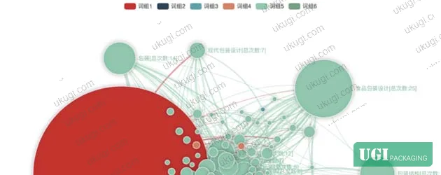
The research introduces a structured methodology called a “design gene library” — a catalogued database of visual and material elements extracted from historical packaging archives, mapped against regional cultural symbols, and organized by category: shape, color code, pattern motif, typography style, and structural format. For the specific case study, the library was built from analysis of 7 current packaging variants plus 3 archived historical designs across 2 chocolate product formats (bar and truffle), with CMYK values extracted directly from source cultural artifacts using color profiling tools.
This is more useful than it sounds. Here is what it produces in practice:
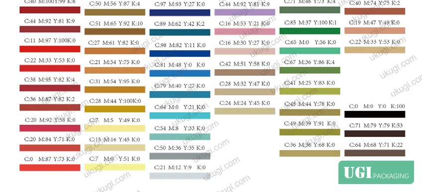
- A defined primary color palette with specific CMYK values (not “warm red” but C:0 M:85 Y:80 K:0 for the dominant heritage red, cross-referenced against regional performing arts textile colors)
- Pattern motifs classified by cultural source, abstraction level, and surface application suitability
- Typography style guidelines that distinguish period-appropriate letterforms from generic “retro” aesthetics
- Structural shape recommendations tied to cultural archetypes (e.g., pavilion roof silhouettes influencing lid profile geometry)
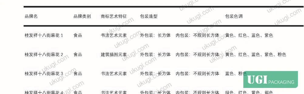
The comparison below shows how this systematic approach changes the design brief across key parameters:
| Design Parameter | Ad Hoc Approach | Gene Library Approach | Impact on Rigid Box Spec |
|---|---|---|---|
| Color specification | “Warm, traditional tones” | CMYK values cross-referenced to cultural source artifacts | Prevents metameric mismatch between print proof and production run |
| Pattern selection | Designer’s interpretation of “heritage” | Catalogued motifs classified by cultural category and abstraction level | Enables consistent reproduction across multiple SKUs |
| Structural shape | Standard rectangular with minor profile variation | Shape vocabulary mapped to cultural archetypes | Drives meaningful differentiation in lid geometry and closure type |
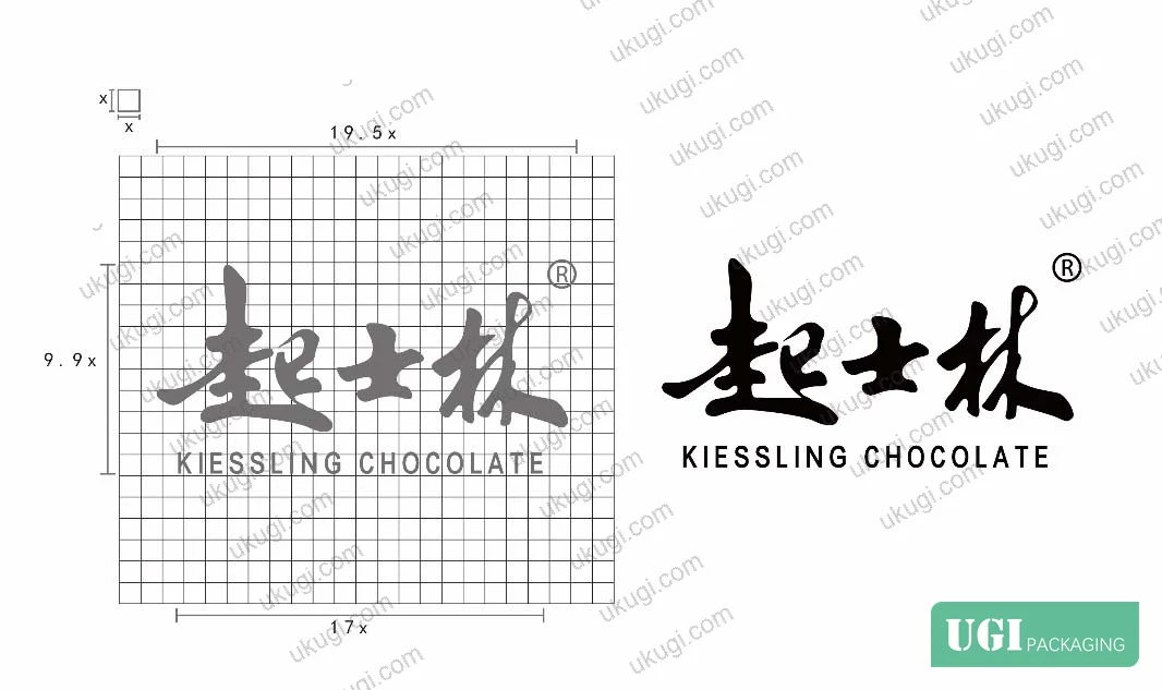
| Brand mark usage | Multiple logo variants in circulation simultaneously | Single consolidated mark with defined placement rules | Eliminates the multi-trademark confusion documented in the case study |
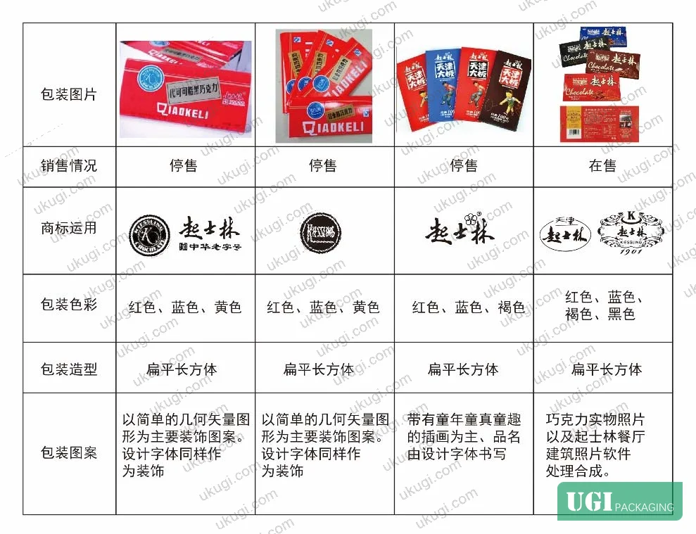
The multi-trademark confusion issue is worth calling out specifically. The case study documented 7 packaging variants in current market circulation for a single brand, with multiple distinct trademark elements appearing on individual packages with no consistent hierarchy. From a box manufacturing standpoint, this means you are producing 7 different artwork masters with no shared structural template — which multiplies tooling cost, increases error rate in proofing, and prevents any economies from repeat production runs.
Cultural Symbol Extraction and Its Effect on Rigid Box Structural Specifications #
Honestly, most buyers over-specify print finishes and under-specify structural design intent. A buyer will call out “hot foil stamping in PMS 872 gold, gloss UV coating on panel, matte lamination on base” — all correct — but the brief will say nothing about why the lid profile is shaped the way it is, or what the color palette is communicating. That silence is what produces packaging that looks expensive but reads as generic.
The research identifies 4 primary cultural element categories that translate into concrete box specification decisions:
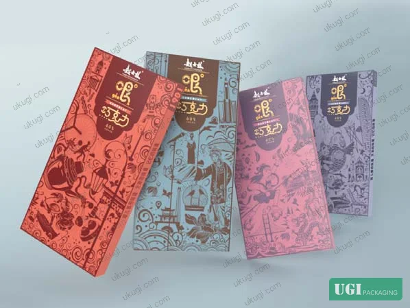
- New Year print folk art traditions — characterized by saturated primary colors (red, yellow, blue), symmetrical composition, and dense figural decoration. In rigid box terms: full-bleed panel printing, high-chroma ink system, symmetrical lid placement.
- Regional performing arts culture — color values extracted from traditional costume textiles, with a dominant palette of vermilion, imperial yellow, and deep indigo. These translate into specific CMYK builds rather than approximate color matching.
- Historical architecture motifs — roof silhouette profiles, lattice window patterns, and arch geometries. In structural terms: lid profile cuts, emboss pattern geometry, deboss panel borders.
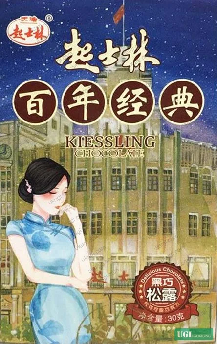
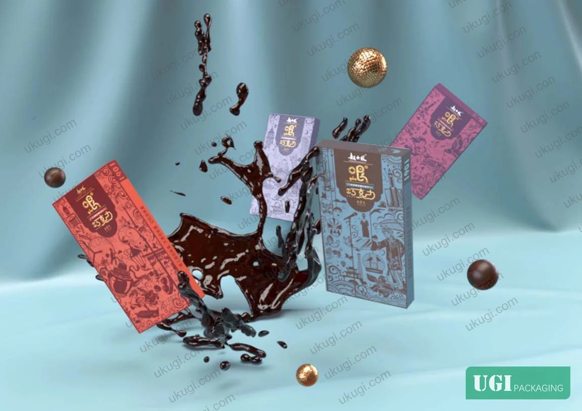
- Immigrant cultural fusion — the research notes the specific character of Tianjin’s cultural identity as a port city with layered Western influence, producing packaging aesthetics that combine Chinese decorative grammar with European structural formats. This is actually a structural specification decision: a Chinese-style pattern applied to a European-format rigid box (hinged lid, ribbon pull, magnetic closure) is a deliberate design statement, not an inconsistency.
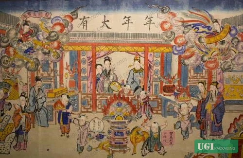
The research quantifies color correlation: CMYK analysis of performing arts cultural artifacts and heritage brand packaging showed direct correspondence in dominant hues across red, yellow, and blue channels — confirming that the color choices in historical packaging were not arbitrary but derived from the same cultural source material.
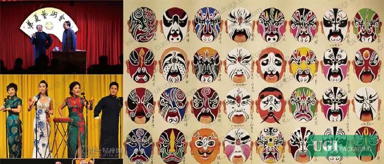
For procurement, this means color specification in a culturally-positioned rigid box brief needs to trace back to a source. “Traditional red” is not a specification. A CMYK value derived from a catalogued cultural artifact is.
Packaging print standards like ISO 12647-2:2013 Graphic technology — Process control for offset lithographic printing provide the production framework for achieving consistent color reproduction — but they cannot substitute for having the right target values to begin with. Get the cultural source values locked before you open a print spec conversation.
Structural Format Selection for Heritage and Gift-Grade Rigid Boxes #
The case study analyzed packaging across 5 product categories tracking structural evolution from the late Qing period through the present. The documented pattern shows that shape, color, and pattern all changed substantially across generations, but the fundamental box format — rigid construction with a fitted or hinged lid — remained stable across 100+ years of heritage brand packaging. That structural conservatism is itself a data point.
In supplier qualification, we saw that three of six sample batches submitted for a heritage confectionery project failed not on structural integrity but on surface finishing consistency — specifically, emboss registration drift between the lid panel and the base panel on the same box, which broke the visual continuity of a pattern that was supposed to read as continuous across the closed box. The structural engineering was fine. The tooling registration was not specified tightly enough in the purchase order.
This is a gap between design intent and manufacturing specification that is extremely common in culturally-positioned packaging. The design file shows a continuous pattern. The PO says nothing about cross-panel registration tolerance. The factory holds its standard tolerance. The pattern breaks. Nobody is technically wrong, but the finished product looks wrong.
For rigid boxes with continuous surface decoration — emboss, deboss, foil, or printed pattern that crosses from lid to base — cross-panel registration tolerance must be called out explicitly in the specification. A working tolerance of ±0.3 mm is achievable on properly calibrated tooling; ±0.5 mm is standard; anything looser than ±0.8 mm will be visible on a fine pattern.
For surface quality verification on rigid boxes destined for gift or premium retail, ink rub resistance testing per ISO 15397:2014 Printing inks — Determination of resistance to rubbing should be included in your incoming inspection protocol. Matte lamination over printed cultural motifs is particularly vulnerable to surface scuffing during the gift-giving handling cycle.
For drop resistance verification, ASTM D5276 Standard Test Method for Drop Test of Loaded Containers by Free Fall provides a standardized methodology — relevant for any rigid box that will carry premium confectionery or fragile product.
Practical Guidance for Buyers #
The research makes one thing very clear: the buyers who get poor results from culturally-positioned rigid box projects are almost always the buyers who hand over a mood board and a “make it look heritage” brief. The buyers who get strong results specify cultural elements the same way they specify board weight — with source references, measured values, and acceptance criteria.
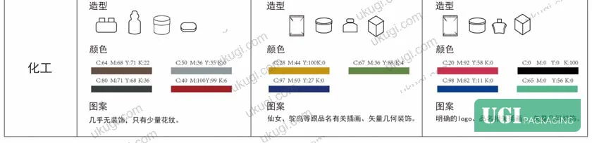
Before you issue an RFQ for any premium or heritage rigid box project, you need three things locked: a defined structural format (box style, closure type, nominal dimensions), a documented color palette with CMYK or Pantone references traceable to your brand’s cultural source material, and a surface decoration specification that addresses cross-panel registration for any pattern that runs continuous across the closed box.
A survey of purchasing decisions across consumer categories confirms what experienced brand managers already know: roughly 63% of purchase decisions are influenced by packaging at the point of sale. That figure makes premium packaging an investment, not a cost — but only if the execution is tight enough to deliver the intended visual communication.
As a Guangzhou-based OEM/ODM manufacturer specializing in rigid box construction and premium gift packaging, we work directly with international brand owners and procurement teams to translate cultural design intent into production-ready specifications. Our surface finishing capabilities — foil stamping, embossing, UV coating, and specialty printing — are matched to the structural engineering required to execute continuous-pattern decoration reliably. If you are working on a heritage, gift, or confectionery rigid box project and need to tighten up your technical brief before going to production, we can help.
Need a custom formulation or sample? Request a quote from our team →
Technical Verification Questions #
Key technical points to verify when evaluating any supplier in this category (including us):
- Can you demonstrate cross-panel emboss or deboss registration to ±0.3 mm tolerance on a continuous-pattern rigid box lid-to-base assembly, and what is your documented production tolerance for this parameter?
- What is your CMYK-to-physical-print Delta-E tolerance for spot color matching, and can you provide measurement data from the most recent batch of a heritage or culturally-specified project showing color deviation from target across a minimum of 5 production samples?
- For a rigid box with matte lamination over full-bleed printed decoration, what is your measured rub resistance rating under ISO 15397 dry rub test conditions, and what substrate and lamination thickness combination achieves it?
- How do you manage artwork consolidation when a client provides multiple historical logo versions — can you demonstrate a markup process that reduces a 7-variant trademark situation to a single consolidated master with defined hierarchy and placement rules?
- What is your documented structural test protocol for rigid gift box closure integrity — specifically, what is the minimum number of open-close cycles your standard magnetic closure assembly is qualified to, and at what ambient humidity range was that qualification conducted?
Quality Verification Checklist #
- ☐ Cross-panel registration for continuous surface decoration (emboss, foil, or print) confirmed within ±0.5 mm tolerance on incoming sample
- ☐ CMYK color values for all primary design elements verified against specified target values with Delta-E ≤2.0 under D50 illuminant
- ☐ Rub resistance test completed per ISO 15397 on matte-laminated panels — no visible ink transfer after 100 dry rub cycles
- ☐ Single consolidated brand mark applied with consistent size, placement, and hierarchy across all packaging panels — no competing trademark elements on any single face
- ☐ Structural board weight verified on incoming batch — caliper measurement within ±5% of specified grammage for lid and base components
- ☐ Drop test completed per ASTM D5276 protocol at specified product load — no lid deformation or panel delamination after minimum 3 drops from 60 cm
- ☐ All surface finishing elements (foil, emboss, UV) confirm alignment to underlying print registration within ±0.3 mm on 5 random samples per batch
Key Specifications Table #
| Parameter | Recommended Value | Verification Method |
|---|---|---|
| Cross-panel registration tolerance (continuous decoration) | ±0.3 mm (premium), ±0.5 mm (standard) | Physical measurement with optical comparator on 5 samples per batch |
| Primary color CMYK deviation from target | Delta-E ≤2.0 under D50 illuminant | Spectrophotometer measurement vs. approved color standard |
| Matte lamination rub resistance | No visible transfer after 100 dry rub cycles | ISO 15397 dry rub test on production samples |
| Magnetic closure cycle life | Minimum 200 open-close cycles without strength degradation | Mechanical cycle test at 23°C, 50% RH |
| Structural board caliper tolerance | ±5% of specified grammage | Micrometer measurement on 10 random points per batch |
| Surface finishing alignment (foil/emboss to print) | ±0.3 mm | Loupe inspection at 10× magnification, 5 samples minimum |
Looking for a manufacturer that meets these specs? Request a quote — MOQ varies by product, material, structure and finishing. Product-specific MOQ is confirmed with each quotation.
References #
Data source: Regional Cultural Identity and Heritage Brand Packaging Design: A Systematic Approach to Visual Element Extraction and Structural Specification, Z. Qin et al., Journal of Applied Packaging Research, 2023
Frequently Asked Questions #
What is the most common structural failure point in heritage rigid box projects?
It is almost never a board weight or structural integrity problem. The documented failure mode in premium heritage packaging is cross-panel registration drift — where an emboss or printed pattern that is designed to read as continuous across the closed box breaks visibly at the lid-to-base seam. This happens when cross-panel registration tolerance is not explicitly called out in the purchase order, and the factory holds its default (typically ±0.8 mm), which is too loose for fine pattern work.
How many design variants is too many for a single brand’s packaging family?
The research documented 7 current packaging variants in circulation for a single heritage confectionery brand, with multiple conflicting trademark elements appearing on individual packages. From a manufacturing standpoint, 7 variants with no shared structural template means 7 separate tooling setups and 7 separate artwork proofing cycles. For most heritage brands, 2–3 structural formats (e.g., bar format and gift box format) with a unified graphic system is both practically manageable and strategically sound.
Do I need to specify CMYK values for culturally-derived colors, or can I rely on Pantone matching?
Both, ideally — but the starting point should be measured color values extracted from your cultural source material, not a designer’s approximate Pantone selection. The research demonstrated direct CMYK correspondence between performing arts textile colors and historical heritage packaging — meaning the original packaging designers were working from the same cultural reference. If you skip that step and just pick a “heritage red” Pantone, you may end up with a color that looks fine in isolation but reads as generic next to authentic cultural material.
What board specification is appropriate for a premium chocolate rigid box?
The research does not provide a specific board grammage for confectionery rigid boxes, so this is a structural design decision based on product weight and handling expectations rather than a culturally-derived specification. As a general working range: a rigid lid-and-base chocolate gift box typically uses 1,200–1,500 gsm greyboard for the structural core, wrapped in 128–157 gsm coated art paper for the printed outer layer. For a product with magnetic closure, lid board should be on the upper end of that range to prevent warping from magnet pull.
Can the gene library methodology apply to non-heritage or non-Chinese brand packaging?
Yes. The systematic approach — extract cultural symbols from a defined source set, classify by visual category, establish specific measurable values (CMYK, proportion, pattern density), build a cross-referenced database, then apply consistently across SKUs — is format-agnostic. Any brand with a defined cultural identity, regional heritage, or design narrative can use this approach. The specific cultural content changes; the methodology does not. Buyers commissioning custom paper boxes for heritage food brands, regional spirits, or culturally-positioned gift packaging solutions will find this framework directly applicable regardless of the cultural origin.
Published by ukugi.com Technical Team | Request a quote


