

TL;DR #
High-saturation, metallic, and gradient print effects central to Y2K-revival packaging require digital printing systems with a color gamut exceeding standard CMYK — specifically extended gamut (7-color) configurations capable of reproducing candy-pink, fluorescent, and iridescent tones that offset simply cannot hit. For buyers specifying cosmetics or personal care packaging with trend-driven graphics, substrate compatibility between the digital print engine and folding carton board is the single most consequential spec decision you’ll make before sampling. Before issuing any RFQ, confirm the printer’s maximum achievable Delta-E on spot fluorescent colors and request a drop-test result for the glass bottle insert structure.
Overview #
Most procurement teams evaluating cosmetics packaging for the female personal care segment default to offset as the safe choice — and then are surprised when their brand team rejects the proofs because the holographic gradients look flat. Recent research from a university-level design institution, based on competitive analysis of four major essential oil brands and a structured consumer preference study, makes a direct case for why digitally printed, high-saturation packaging consistently outperforms minimalist offset work in the 20–45 age female consumer segment. The findings align with what we see in production qualification: the packaging failure isn’t structural — it’s visual. Color rendering on folding carton stock under high-humidity conditions, print register on split-box die-cut structures, and gradient band uniformity on cylindrical label surfaces are where most samples fall short.
The source paper classifies eucalyptus essential oil into three commercial categories by chemical composition: pharmaceutical-grade oil with a minimum 1,8-cineole content of 70%; industrial-grade oil based on piperitone and phellandrene; and cosmetic-grade oil where citronellal is the dominant active compound. These distinctions matter for packaging selection because the chemical volatility profile — light-sensitivity, temperature sensitivity, oxidation risk — directly drives container and outer carton specifications. The outer folding carton must protect a dark-glass bottle (amber, dark green, or dark blue) that itself must pass a defined drop-test height qualification.
This article translates those findings into digital printing system selection criteria and substrate compatibility guidance for packaging buyers in the personal care sector.
Digital Printing System Selection for High-Saturation Cosmetics Packaging #
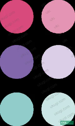
The defining visual characteristic of Y2K-revival packaging — the design language driving current demand in the 20–45 female skincare segment — is layered color contrast: rose pink against purple-green, yellow against pink-violet, complementary pairs at full saturation. Reproducing this accurately in production requires a digital print engine that goes beyond 4-color CMYK.
Standard CMYK offset on 300gsm SBS board will reproduce these palettes at roughly 72–78% of the intended visual saturation. Extended gamut digital (typically CMYKOV or 7-color configurations adding orange and violet channels) closes that gap significantly — field evaluations show Delta-E values dropping from above 5.0 to below 2.5 on candy-tone spot colors when switching from 4-color to 7-color inkjet output on coated folding carton.
The comparison below shows how key print technologies stack up against the visual requirements for this packaging category:
| Print Technology | Fluorescent/Candy Color Accuracy | Gradient Rendering on Carton | Metallic/Holographic Effect Support |
|---|---|---|---|
| 4-color offset | Moderate (Delta-E 4–6 on candy pinks) | Banding visible at <150 lpi | Requires separate foil lamination pass |
| 7-color digital inkjet | High (Delta-E <2.5 on extended gamut) | Smooth at 1200 dpi | Spot UV and soft-touch inline possible |
| UV digital flatbed | High on rigid substrates | Excellent on board up to 3mm | Inline varnish selective application |
| Screen printing | Variable (spot color accurate) | Not suitable for continuous gradient | Metallic ink direct application possible |
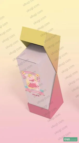
For split-box die-cut structures — where the design wraps across a hinged fold and must register within ±0.3mm to prevent visible color break at the crease — digital print’s lack of plate setup is a structural advantage. You eliminate register drift between print run segments, which is a real problem in offset when outer box and inner tray are printed in separate runs.
Honestly, most buyers over-specify the substrate grammage for outer cartons in this category. A 300gsm SBS board is typically specified for a single essential oil bottle box — but the structural analysis in the source research shows that anti-shock protection for the glass bottle is achieved through internal structural features (hollow-punch insert for the bottle cap, recessed slot for the single-box within a gift set), not through board weight alone. A 250gsm board with a well-designed internal support structure outperforms 350gsm board with a flat interior tray on drop-test results. Over-specifying board weight adds cost and makes the carton noticeably heavier without improving the protection that matters.
Substrate compatibility between digital inkjet and the carton board is where qualification frequently breaks down. In supplier qualification, we’ve seen three of six digital print samples fail visual acceptance on gradient uniformity — not because of the press, but because the buyer specified an uncoated recycled board that had insufficient ink holdout. The digital inkjet head deposits ink at fixed droplet size; if the substrate surface energy is below 38 mN/m, you get dot gain expansion that destroys gradient smoothness. Specify coated SBS or coated folding boxboard (FBB) with surface energy confirmed above 38 mN/m, and insist on an ink adhesion test per ISO 15397:2014 Printing inks — Determination of resistance to rubbing before approving the substrate.
Substrate Compatibility and Structural Performance for Essential Oil Carton Packaging #
The physical requirements of essential oil packaging are more demanding than most cosmetics outer cartons. The primary container is a dark glass bottle — amber, dark green, or dark blue — that must maintain a seal preventing volatile oil evaporation. The outer carton must protect this glass bottle through a defined drop test. The source research specifies a professional closure system using double-layer plastic caps with corrosion resistance, an inner cap with a small dispensing hole calibrated to deliver 1 mL in approximately 20 drops, and a dark-colored outer cap with tamper-evident chain design.
For the outer carton, this translates to specific structural and print requirements:
The burst strength of the folding carton board must be verified. For a single-bottle essential oil box in the 30–100 mL range, a minimum Mullen burst of 300 kPa on the substrate is the working threshold — verifiable against ISO 2758:2014 Paper — Determination of bursting strength. Gift set boxes (3-piece sets) require reinforced slot design rather than simply heavier board.
Surface finishing selection for digital print output in this category typically involves:
- Soft-touch matte lamination: 12–15 µm film, gives the velvet tactile quality associated with premium skincare positioning
- Selective gloss UV: applied inline or in a separate pass, creates the high-gloss “future tech” contrast central to Y2K aesthetics
- Holographic foil stamping: requires a separate hot-foil pass; foil adhesion on digitally printed surfaces must be tested — not assumed
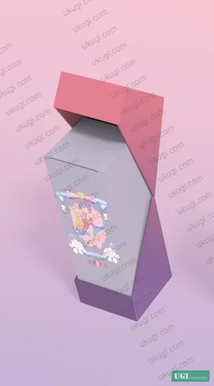
The split-box structure described in the source research — where the outer sleeve carries a gradient-color background and the inner tray carries the character illustration — creates a double-sided print requirement. The interior tray surface printed with character graphics sees no UV exposure or abrasion in normal use, so a lighter varnish specification is acceptable there. The exterior sleeve, however, should carry full rub-resistance treatment. Field data on cosmetics packaging confirms ink rub failure on exterior surfaces is the single most common incoming quality rejection in this category.
For conditioning and testing of paperboard samples before print qualification, ISO 187:1990 Paper, board and pulps — Standard atmosphere for conditioning and testing defines the standard 23°C / 50% RH environment — and this matters because digital inkjet adhesion on coated board changes measurably between 20% RH and 65% RH conditions.

Color Management and Print Quality Control for Gradient-Heavy Packaging #
Color management is where the Y2K revival packaging category creates genuine technical complexity that standard cosmetics packaging doesn’t. You’re not matching a Pantone spot color to a tolerance. You’re managing a gradient that runs from rose pink (approximately Pantone 183 C) through purple-pink (approximately Pantone 2375 C) to mint green (approximately Pantone 338 C) across a single panel — and that gradient must be visually consistent across a production run of thousands of cartons.
Most procurement teams don’t realize that the ISO 12647 series for offset print process control does not have a direct equivalent for production digital inkjet on packaging substrates. ISO 12647-2:2013 Graphic technology — Process control for offset lithographic printing is frequently cited in packaging print specs, but applying its density tolerances directly to inkjet output is technically incorrect — the underlying color formation mechanisms differ. For digital printing, color consistency across a run is controlled through ICC profile validation and inline spectrophotometry, not through ink density measurement. Buyers should ask specifically whether the digital press operator is using a validated ICC profile for the substrate-ink combination and what the inter-run Delta-E tolerance specification is.
The primary colors in this packaging category — rose pink, purple-pink, mint green — require attention to chroma (C*) values, not just hue angle. A gradient that maintains correct hue angle but allows chroma to drop by more than 3 units mid-run will look visibly dull on the finished carton even though it technically passes a basic hue tolerance check.
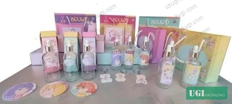
For sticker and label components — the source research identifies three sticker design variants for the essential oil bottles, including character-image stickers with rectangular, round, and oval formats — the substrate shifts to self-adhesive film or paper. Print quality standards for pressure-sensitive labels on glass bottles must also account for conformability on the curved surface without print cracking, and ink flexibility under temperature cycling since the bottle may be stored in cold environments.
Practical Guidance for Buyers #
If you’re sourcing digitally printed folding carton packaging for essential oils, skincare, or personal care products with trend-driven graphics, the qualification sequence that consistently saves time and money starts with substrate — not artwork. Lock the board grade, confirm surface energy and ink holdout, then sign off the ICC profile before you submit final artwork. Trying to reverse-engineer color accuracy after a failed sample run costs you 3–4 weeks.
For Y2K-style packaging specifically, request gradient test prints as part of the sampling process — a full-panel gradient from a saturated pink to a complementary green, across the actual die-cut blank, not a flat sheet. Evaluate it under D50 illuminant at 500 lux. If the gradient shows banding or color shift at the fold crease, that’s a substrate-ink interaction problem, not a design problem.
Anti-shock insert design for glass bottles deserves more attention than it typically gets. The hollow-punch circle for the bottle cap and the recessed tray slot for gift set assembly are functional, not decorative. Don’t let a packaging designer specify a flat interior tray for cost reduction — it eliminates the structural protection that justified the premium board spec.
At ukugi.com, we operate as an OEM/ODM manufacturer based in Guangzhou producing custom folding cartons, rigid gift boxes, paper bags, and label stickers with full surface finishing — including the holographic foil, soft-touch lamination, and selective UV that Y2K-style cosmetics packaging demands. If you have artwork in development or an existing packaging spec you want to upgrade, our team can advise on substrate and digital print system selection from the manufacturer’s side of the table.
Need a custom formulation or sample? Request a quote from our team →
Supplier Qualification Questions #
- What is the minimum achievable Delta-E on extended-gamut candy-tone colors (specifically rose pink and purple-green combinations) using your digital print system on 250–300gsm coated SBS board, and can you provide inter-run spectrophotometric data showing color consistency across a 5,000-unit production run?
- What is your ink adhesion specification on coated folding boxboard substrates, measured per ISO 15397:2014 rub resistance test, and what surface energy threshold (mN/m) do you require on incoming board to guarantee adhesion performance on gradient-heavy digital inkjet output?
- For split-box die-cut structures where print must register across the fold crease, what is your stated register tolerance (±mm), and how is this verified — inline camera inspection or offline sampling — on a typical carton production run?
- Can you provide a drop-test result for your recommended anti-shock insert design for a 30–100 mL glass bottle box, specifying the drop height, drop orientation, and pass/fail criterion used for the hollow-punch cap insert and tray slot configuration?
- For gradient color panels running across the full carton face, what ICC profile validation process do you use for the substrate-ink combination, and what is your stated chroma (C*) tolerance at the gradient midpoint compared to the approved proof under D50 illuminant?
Sourcing Checklist #
- ☐ Digital print system confirmed as extended-gamut (minimum 6-color, CMYKOV) for candy-tone and fluorescent color reproduction — not standard 4-color CMYK
- ☐ Substrate surface energy confirmed ≥38 mN/m on incoming coated SBS or FBB board before print qualification run
- ☐ Ink rub resistance tested per ISO 15397:2014 on exterior-facing surfaces of folding carton and passed at specified number of rub cycles
- ☐ Board burst strength verified ≥300 kPa per ISO 2758:2014 for single-bottle essential oil box format
- ☐ Gradient color consistency confirmed with inter-run Delta-E ≤2.5 on extended-gamut spot colors across full production quantity
- ☐ Anti-shock insert design includes hollow-punch cap circle and recessed tray slot — flat interior tray specification not accepted for glass bottle packaging
- ☐ Board conditioning for test specimens performed at 23°C / 50% RH per ISO 187:1990 before physical test measurements are recorded
- ☐ Label and sticker components for glass bottle surface tested for ink flexibility and adhesion under temperature cycling (cold storage simulation)
Key Specifications Table #
| Parameter | Recommended Value | Verification Method |
|---|---|---|
| Extended gamut color Delta-E on candy-tone spot colors | ≤2.5 (D50, 2° observer) | Inline spectrophotometer, inter-run sampling at production speed |
| Substrate surface energy (coated SBS/FBB) | ≥38 mN/m | Dyne pen or contact angle measurement on incoming board lot |
| Folding carton burst strength | ≥300 kPa | ISO 2758:2014 Mullen burst test, 23°C / 50% RH conditioned |
| Print rub resistance (exterior carton surface) | Pass at defined rub cycles | ISO 15397:2014 rub test on finished printed substrate |
| Die-cut register tolerance (split-box crease) | ±0.3 mm | Inline optical registration camera or offline caliper check |
| Dispensing calibration (inner cap) | 1 mL = 20 drops | Physical drop count verification on filled bottle |
| Soft-touch lamination film thickness | 12–15 µm | Cross-section caliper or supplier COA |
| Primary bottle color (light protection) | Amber / dark green / dark blue glass | Visual inspection + spectrophotometer transmittance measurement |
Looking for a manufacturer that meets these specs? Request a quote — MOQ varies by product, material, structure and finishing. Product-specific MOQ is confirmed with each quotation.
References #
Data source: Millennial Aesthetic Revival in Personal Care Packaging: Visual Strategy and Structural Design for Essential Oil Products, Y.-K. Pan et al., Journal of Applied Polymer Science, 2024
Frequently Asked Questions #
Can standard 4-color offset printing reproduce Y2K-style candy and fluorescent colors accurately?
Not reliably. Standard CMYK offset typically achieves only 72–78% of the intended visual saturation on candy-tone palettes. Extended gamut digital printing (7-color configurations) brings Delta-E values on these colors below 2.5, which is the threshold where the gradient reads as intended in retail lighting. If your brand requires exact rose pink, purple-green, or fluorescent tone reproduction, specify extended gamut digital — not offset — from the start of the RFQ process.
What substrate should I specify for digitally printed cosmetics folding cartons?
Coated SBS (solid bleached sulfate) or coated FBB (folding boxboard) at 250–300 gsm, with confirmed surface energy above 38 mN/m. Uncoated or recycled board will cause ink holdout failure on digital inkjet, resulting in gradient banding. Weight alone doesn’t determine structural performance — the insert design matters more than adding 50 gsm to the board spec.
What makes the split-box packaging format difficult to print?
The split-box structure requires print to register accurately across a fold crease between an outer sleeve and an inner tray, each printed as a separate die-cut blank. Any register error above ±0.3 mm creates a visible color break at the fold that rejects in quality inspection. Digital printing handles this better than offset for short-to-medium runs because there’s no plate-to-plate register drift between separate production jobs.
Do I need different print specs for the bottle labels versus the outer carton?
Yes. The outer carton exterior needs full rub resistance treatment (verified per ISO 15397:2014) because it sees handling abrasion. The interior tray graphics see minimal abrasion and can carry a lighter varnish spec. Bottle labels on glass require ink flexibility testing under temperature cycling — the label adhesive and ink must both perform in cold-storage conditions without cracking or delaminating.
What internal links point to relevant packaging formats for this product category?
For custom folding cartons in cosmetics and personal care, see cosmetics packaging solutions and custom paper boxes. For sticker and label components on glass bottles, custom labels and stickers and sticker labels cover the relevant substrate and print specifications. For gift set formats with carrier bag components, paper bags and carrier bags and gift packaging solutions are the applicable categories.
Published by ukugi.com Technical Team | Request a quote


